Juicebox
creative direction, transmedia design, multicultural branding development, typography, type design, print, screen, photography, cinematography
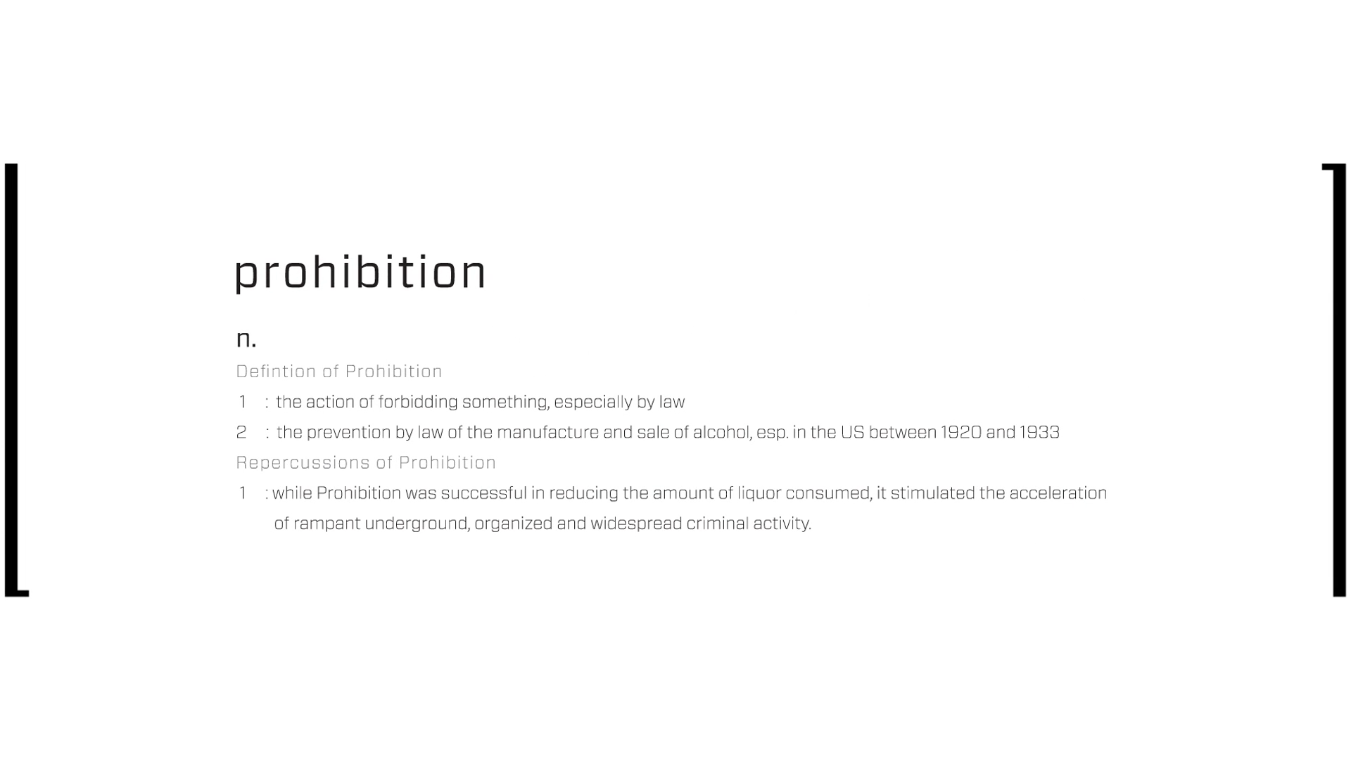
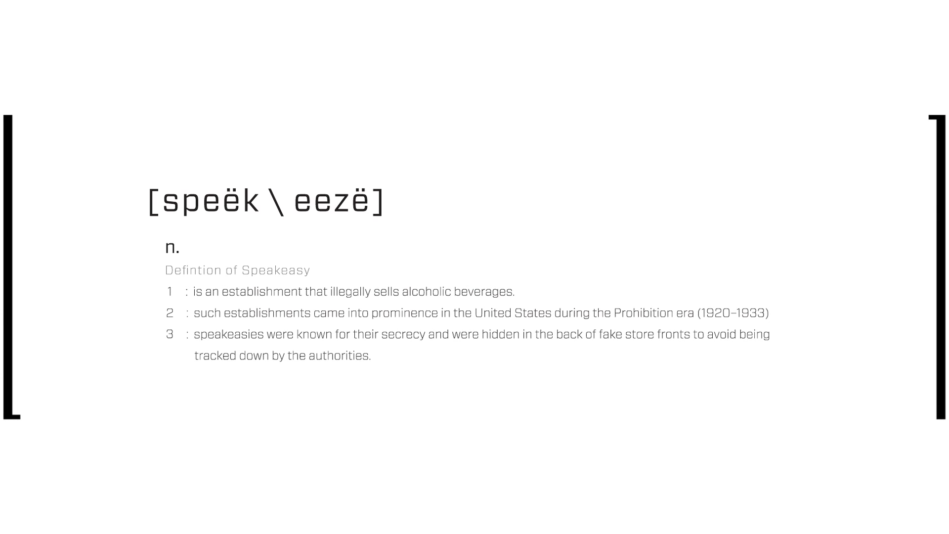
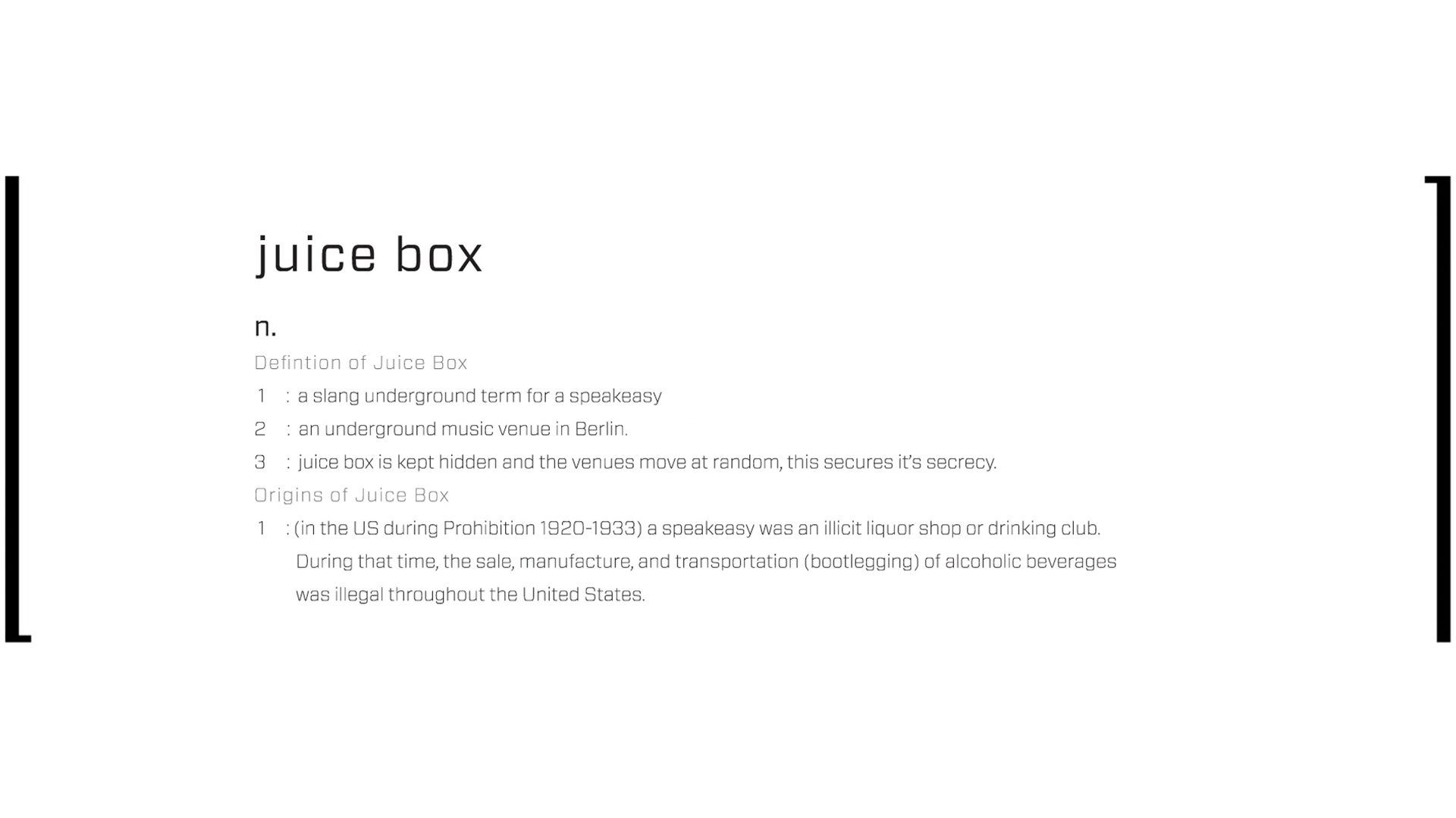
The Juicebox brand addresses club and bar culture in Berlin. The goal was to create a music venue for local millennials utilizing aspects of American culture that would resonate with a European audience in the Entertainment Industry. We looked to the Prohibition era of speakeasies as a source of inspiration. Utilizing moving venue locations and a scavenger hunt to each event we created an exclusive underground experience for Berliners with the intention of keeping out tourists.
Collaborated with Jessica Cha, Jeremy Christiano, and Paola Meraz.
Branding
concept development
Branding
identity
Anamorphic Logo
branding, typography, logo design
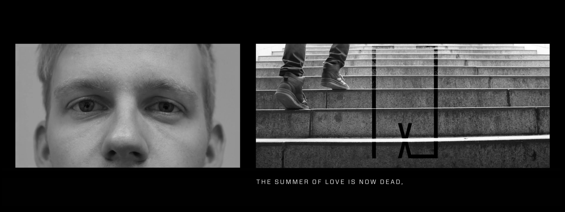
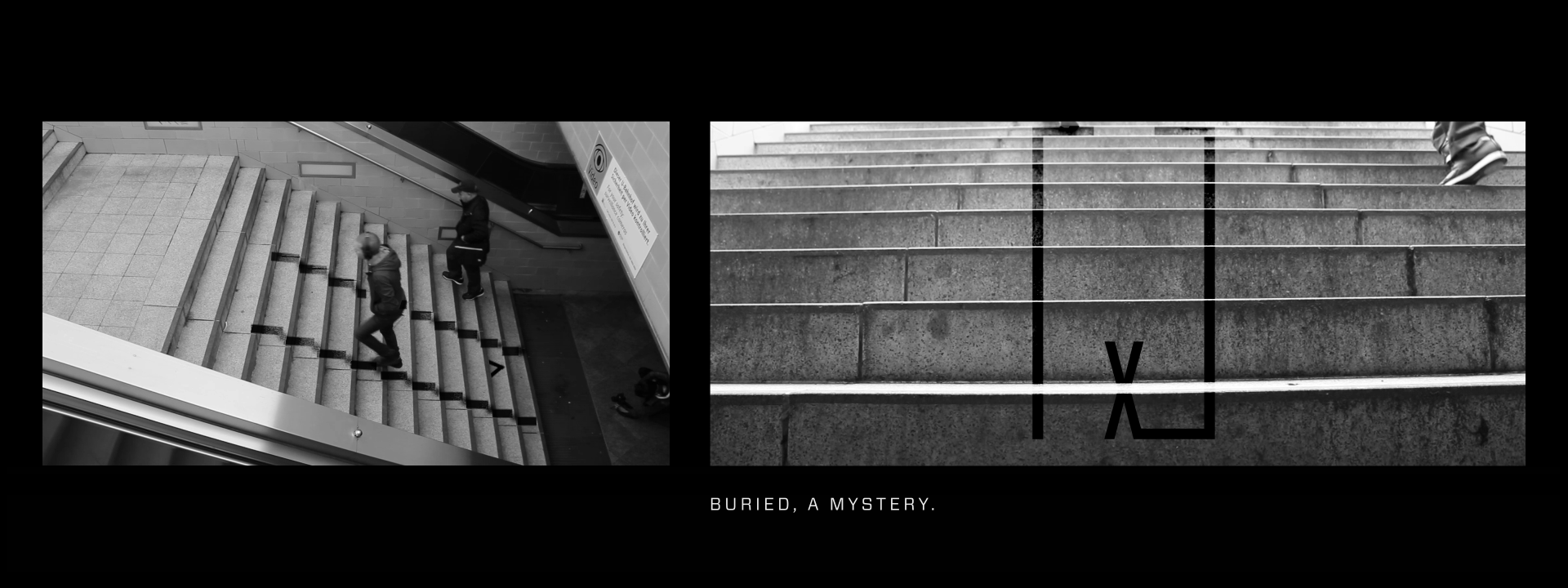
The anamorphic logo was used to keep Juicebox an underground brand. We used it as a way to mark locations on the journey to our destinations. The user would need to locate them in just the right place in order to see the anamorphic logo in one piece. X marks the spot. The anamorphic logo would point them to a clue or to the next location on our scavenger hunts eventually leading to the underground venu.
Juicebox Brand Typeface
branding, typography, type design
The objective was to create a typeface that resembled a bar code. The Juicebox Typeface was meant to appear as a non-legible image and on second glance legible typography. Juicebox was meant to hide in plain sight, and with the use of this typeface among our anamorphic logo, this goal is achieved.
Juicebox Typeface - Letterforms

Juicebox Typeface - Numbers, Symbols

Supporting Brand Typography
We wanted to use a more legible font in support of the Juicebox brand typeface that had roots in the prohibition era with a modern twist. Vitesse Sans has the DNA of a slab serif typeface similar to those used during the timeframe, but Vitesse is built on the foundation of a neo-grotesque font. Vitesse Sans was created on a rounded rectangular grid which is similar to the geometric approach utilized in the design of modern neo-grotesque fonts such as Akzidenz, Futura, or Helvetica.
Vitesse Sans Book
Sans Serif, Neo-grotesque
Vitesse Sans Medium
Sans Serif, Neo-grotesque
Vitesse Sans - 55 Book
aäbcdefghijklmnoöpqrsßtuüvwxyz
AÄBCDEFGHIJKLMNOÖPQRSTUÜVWXYZ
1234567890(,./!@#$%^&*\-_+=)
Vitesse Sans - 65 Medium
aäbcdefghijklmnoöpqrsßtuüvwxyz
AÄBCDEFGHIJKLMNOÖPQRSTUÜVWXYZ
1234567890(,./!@#$%^&*\-_+=)
Print Design
packaging
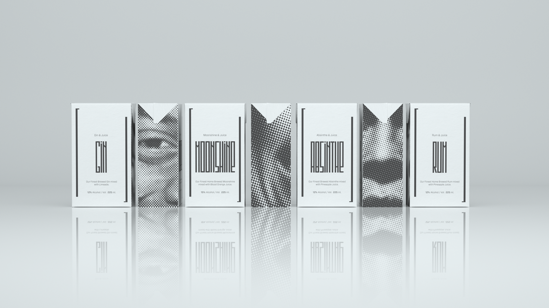
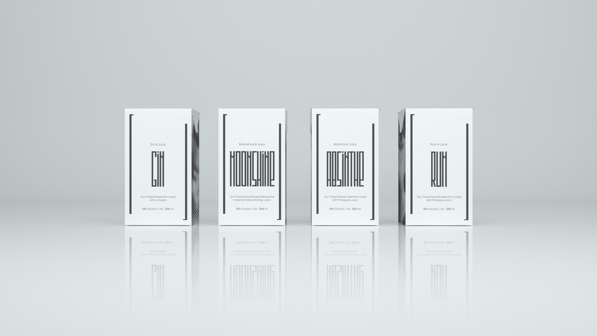
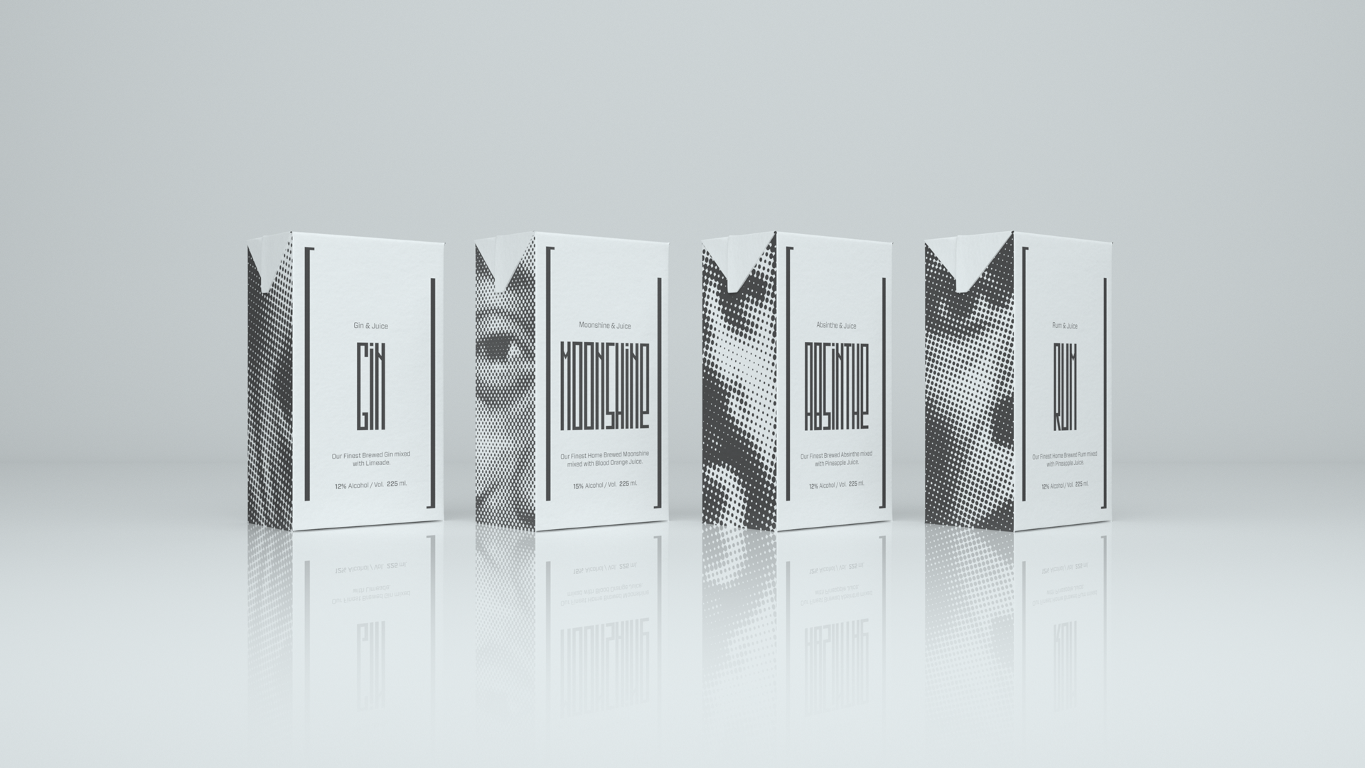
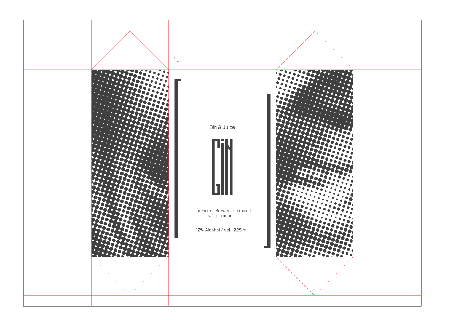
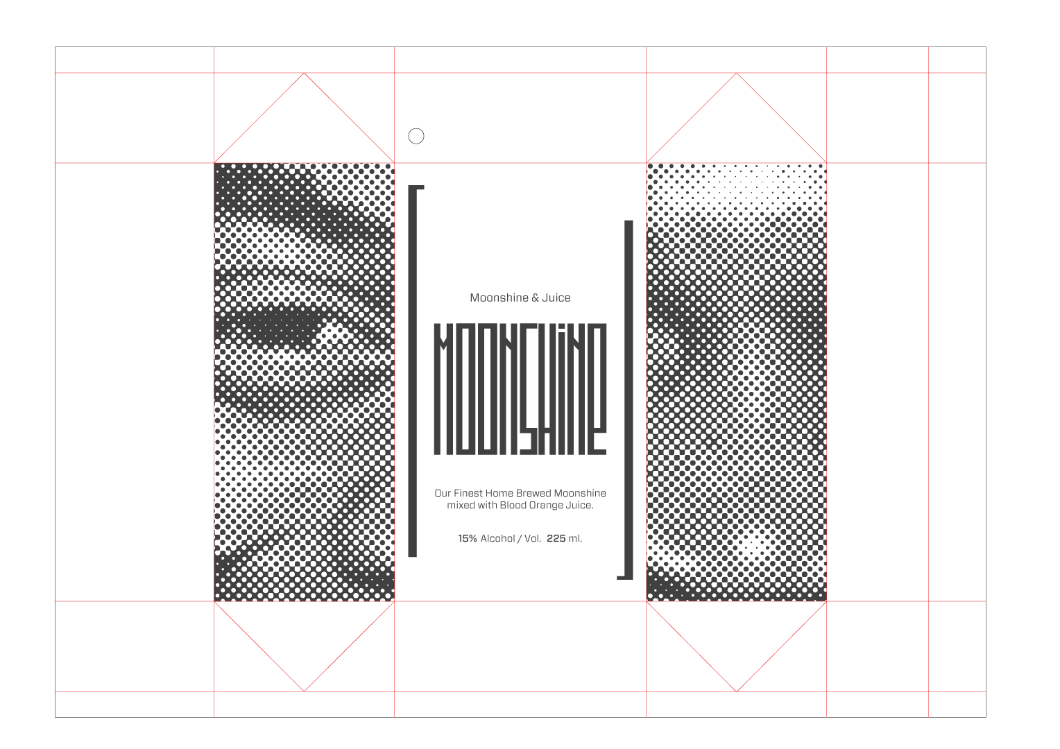
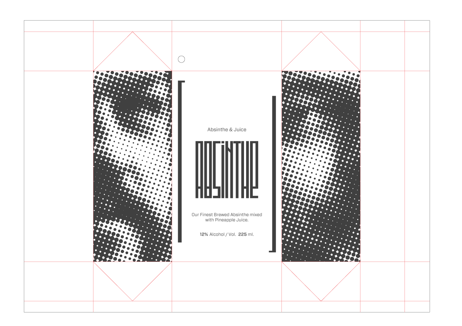
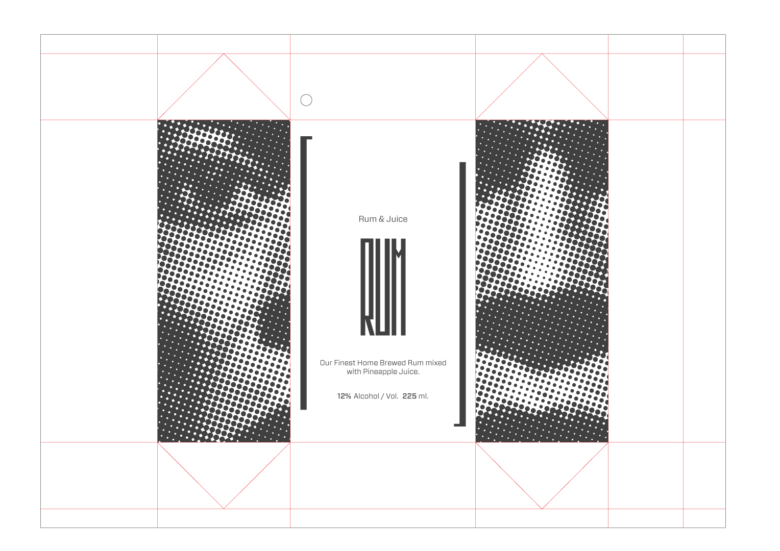
Juicebox Packaging
transmedia design, branding, typography, product design, packaging, print
We created Juicebox packaging for alcoholic beverages at our events depicting some of the greatest musical acts in history such as Etta James, Miles Davis, and Fela Kuti. Playing off the idea of homemade alcohol at a speakeasy we thought it would be appropriate to create a small line of mixed drinks using the juice box form factor. Using temperature sensitive inks we created a print design that is visible when the drink is chilled and invisible at room temperature. This helped add to the secrecy of Juicebox events. If someone takes the juice box with them from one of our shows the ink will slowly disappear as the temperature of the juice box increases.

Packaging Dielines
juice box / milk carton
Motion Design
video marketing
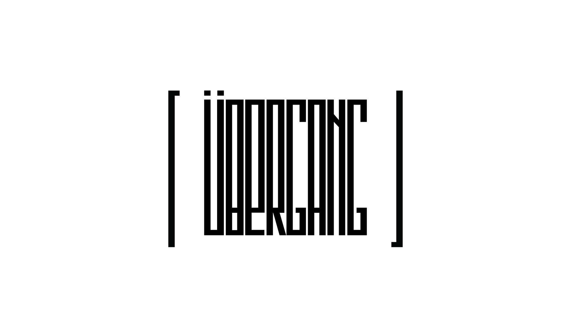
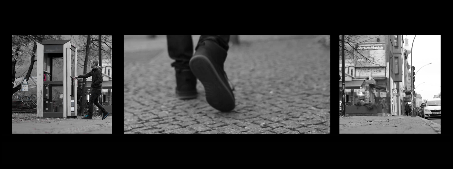
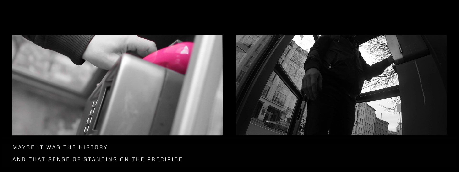
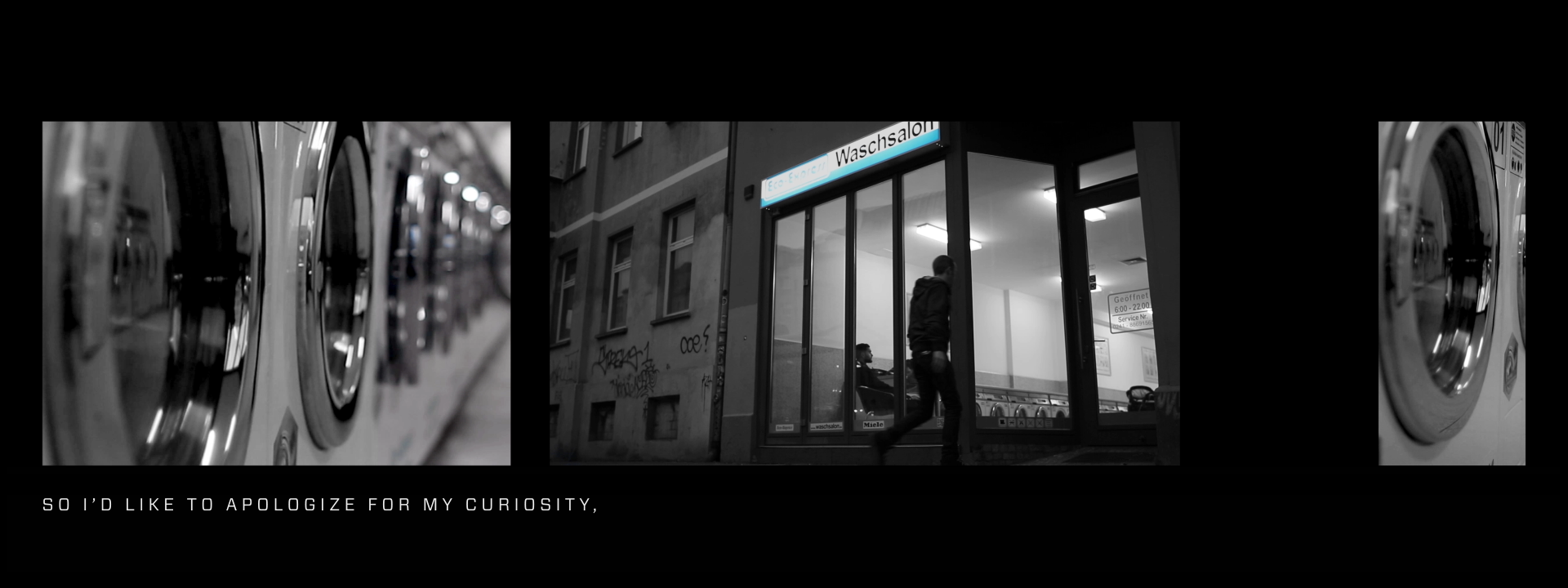
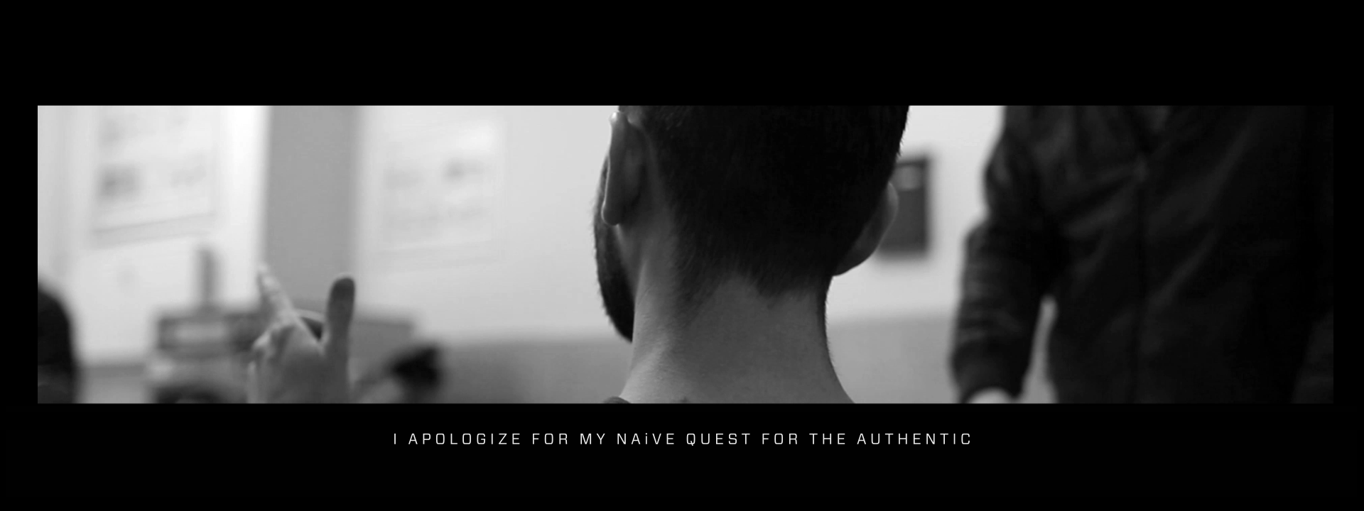
Übergang Video
transmedia design, branding, typography, motion design, live-action, marketing
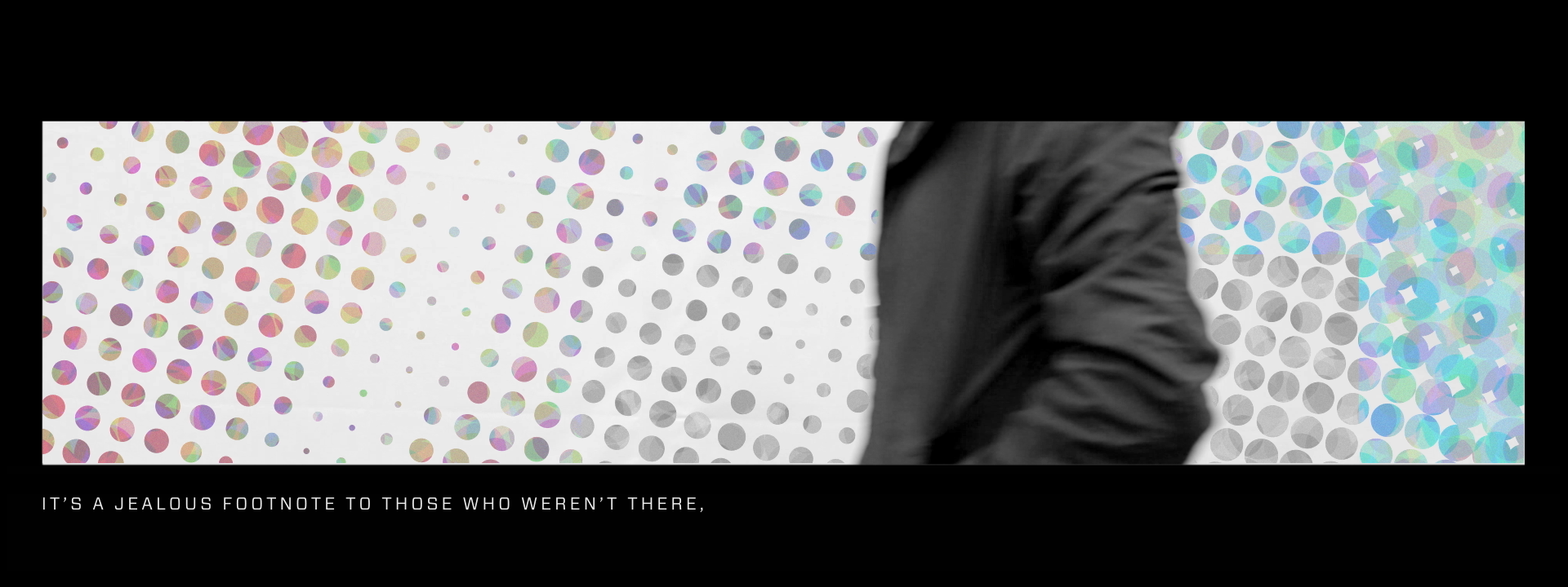
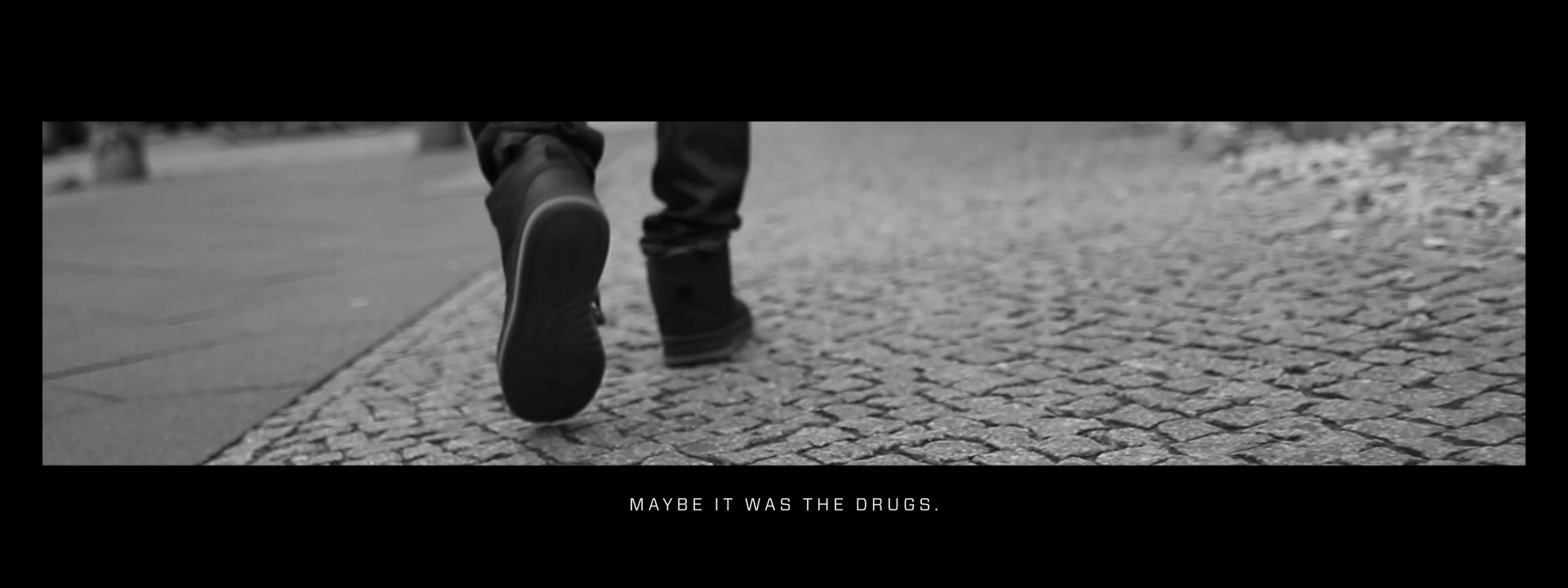
The Übergang video was created as a marketing tool to introduce our brand and to illustrate the scavenger hunts required to find our Juicebox venues. We embedded QR codes in posters and street art throughout Berlin as a means for our audience to find the video. Übergang was inspired by an excerpt called “Some apology to Berlin” taken from the first issue of Übergang, a cultural and literary magazine. The excerpt from Übergang, meaning the crossing or transition, perfectly describes the pain points our brand was trying to fulfill in the entertainment industry to local Berliners. We created a video for both German and English speaking audiences.
Übergang Deutsch
Übergang English
Juicebox
project research
What is Juicebox?
project research, entertainment industry, berlin, underground, night life, bars, clubs, music
This is a short video explaining what we were doing out in Berlin and the brand we created for Berlin millennials. The video dives into the research of identifying what Berliners craved in one of the best music scenes in the world, and the pain points we were trying to solve within the local entertainment industry. The Juicebox brand is the culmination of our research and was created to fill the void that Berliners craved in their music scene.
Selected Works
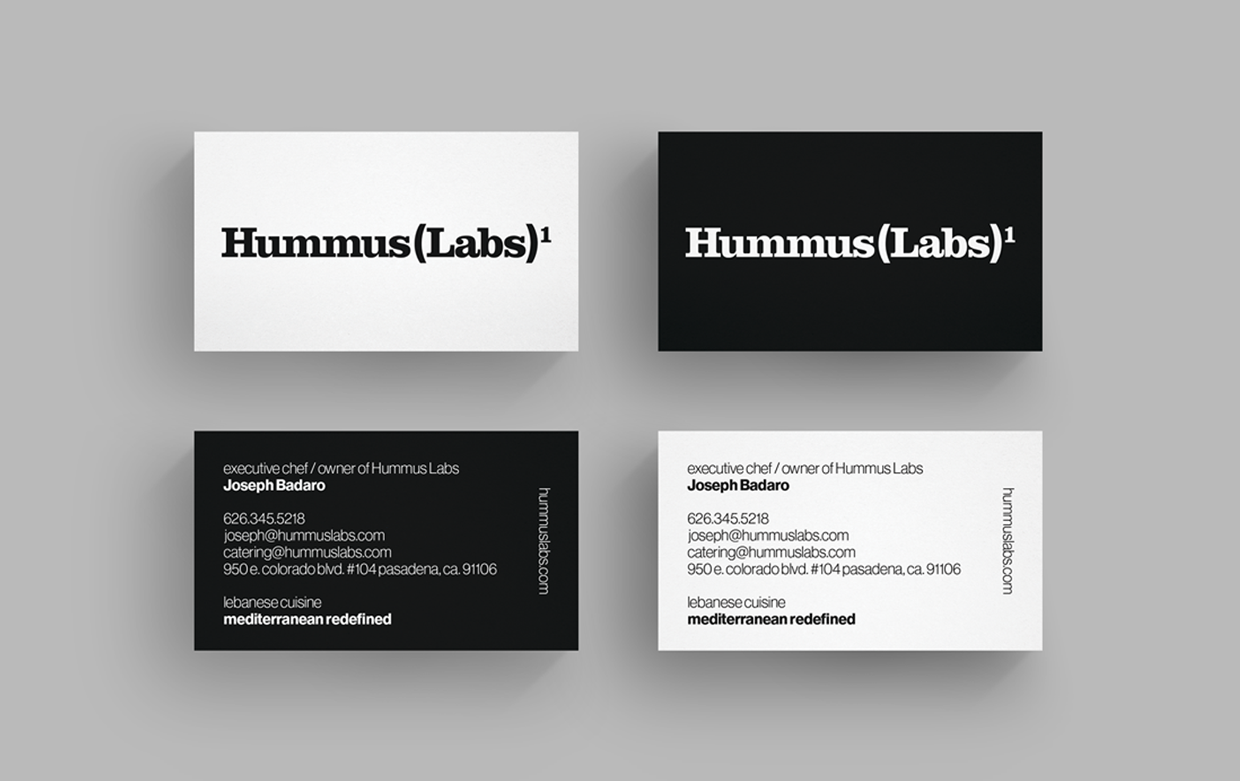
Hummus Labsbranding, creative direction, transmedia design, marketing, ada compliance

Smartracbranding, creative direction, transmedia design, marketing
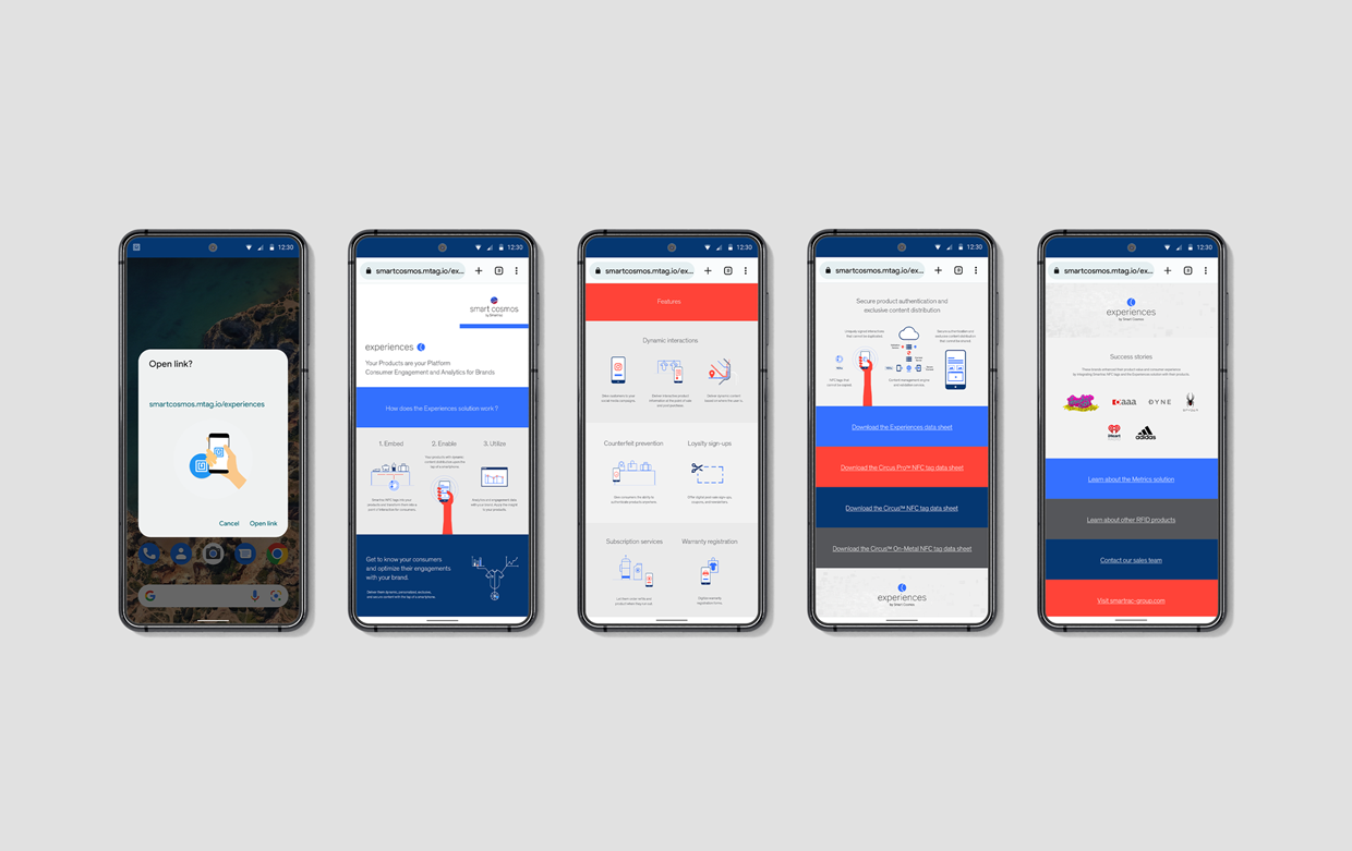
Smart Cosmosbranding, creative direction, transmedia design, marketing
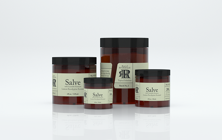
Root of Ruderalisbranding, creative direction, transmedia design, marketing
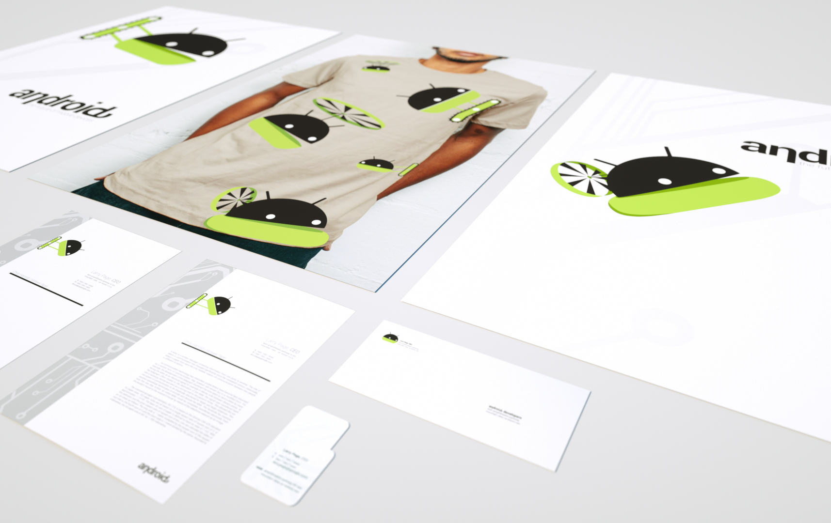
Androidbranding, creative direction, transmedia design, marketing
Juiceboxbranding, creative direction, transmedia design, marketing, entertainment
©2024 murphy_armitage