Android
transmedia design, concept development, branding, creative direction, product development, product marketing, print, motion design, live-action, web
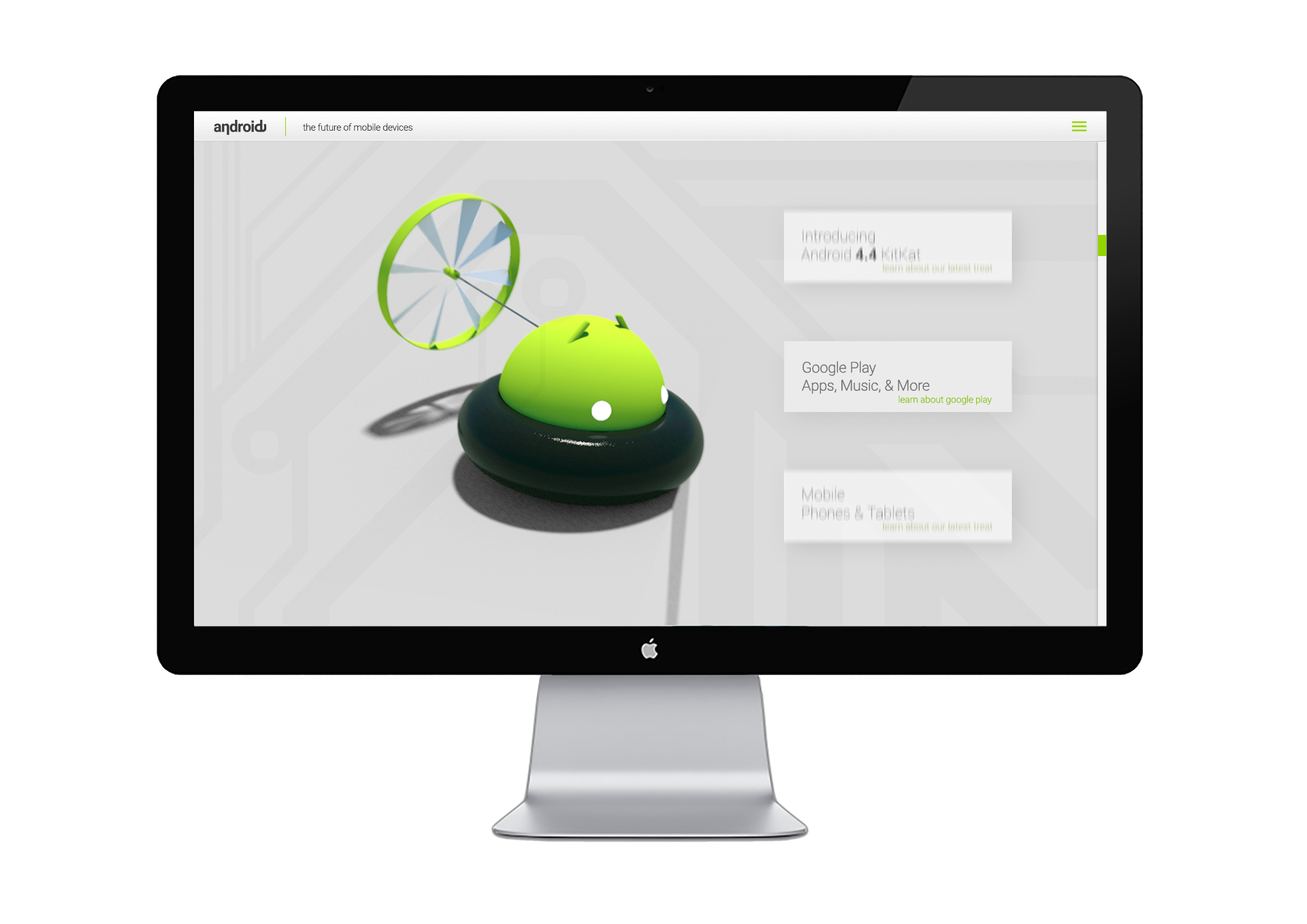
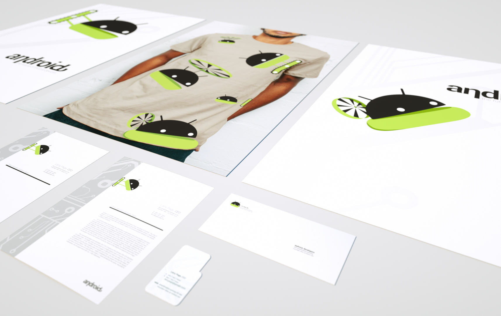
The Android rebrand was created with the goal of expanding the user base of the Android mobile phone platform from the primarily tech savvy user base to older and younger non-tech savvy mobile phone users. When the iPhone and iOS came onto the mobile scene the platform dominated because it was deemed the most easy to use smartphone on the market. Android phones have always been very simple and easy to use and through a rebrand I wanted to change that perception. I created a new logotype and logomark based on the original identity system with a more personified Android logomark. The new identity system is friendly, versatile, fun, and seamlessly integrates into 2D, 3D, and Live-Action environments.
Branding
concept development
Brand Goals and Research
attributes
friendly
fun
versatile
clean
approachable
minimal
low-tech
sidekick
integrate
2D
3D
live-action
android (n.)
1. A robot with humanistic attributes and/or appearance.
2. An open-source mobile operating system built on a modified version of the linux kernel. Android was designed originally by the Open Handset Alliance, and is currently owned by Google. At its core, the operating system is known as the Android Open Source Project (AOSP) and is free and open-source software (FOSS) primarily licensed under the Apache License. However, most devices run on the proprietary Android version developed by Google, which comes with additional closed-source software.
3. Android is used on Google Pixel devices and many other device manufactures such as Motorola, Samsung, and Sony.
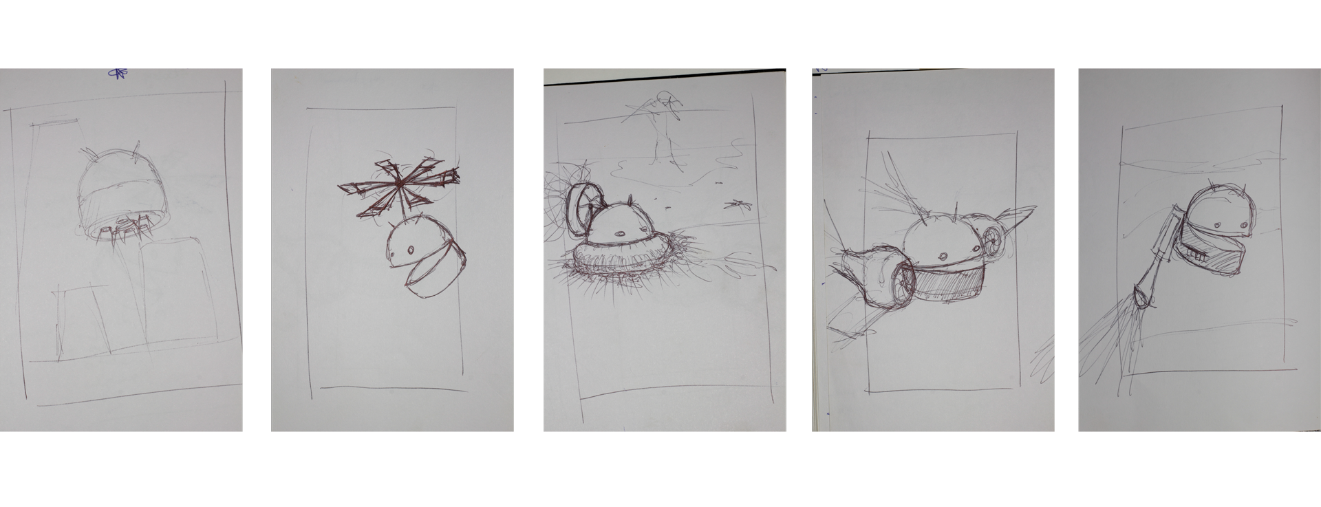
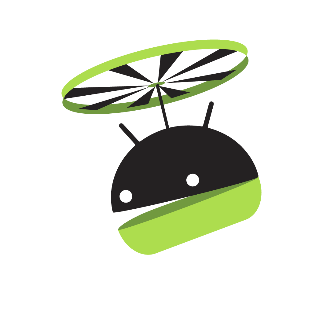
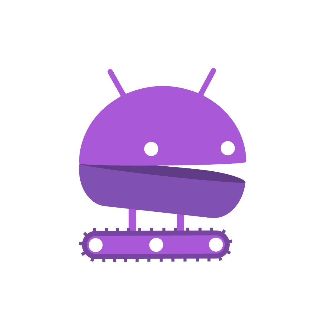
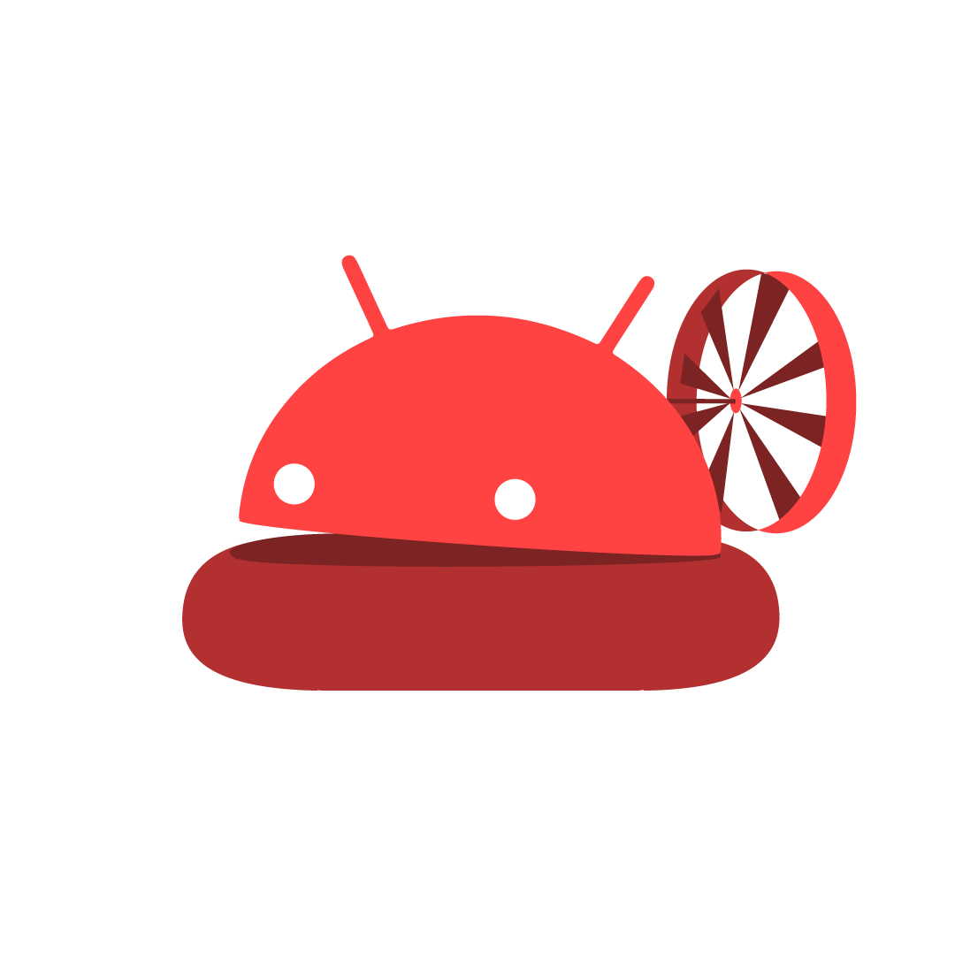
Logomark Sketches
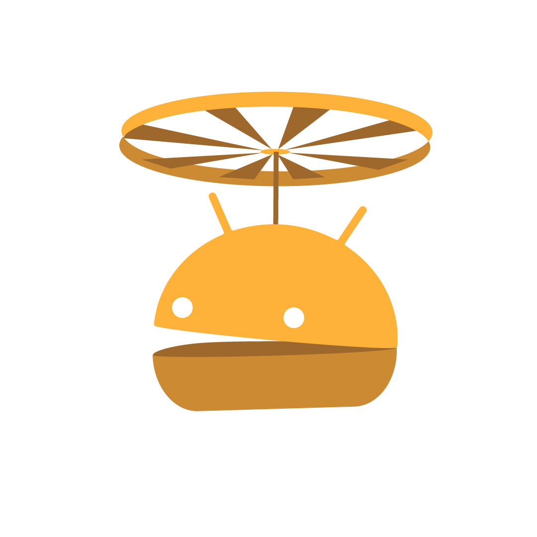
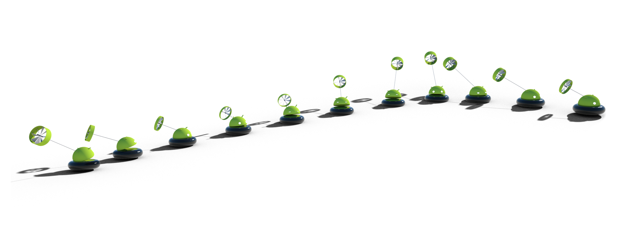
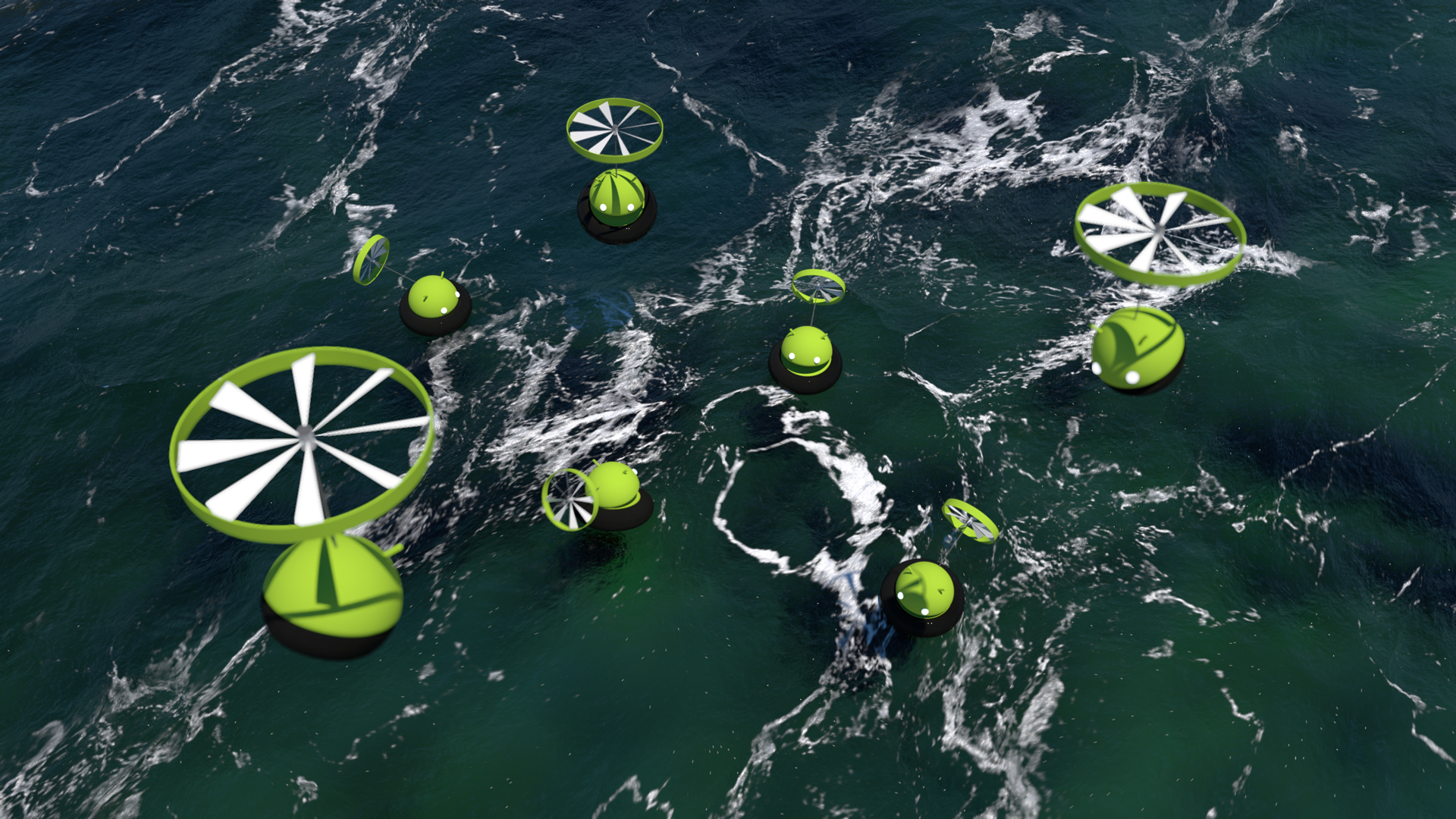
The original logomark was rigid and didn't have much character. With a bit of personification I brought the logomark to life using different modes of transportation. Giving the Android a means for moving around and shifting between forms helped give the brand a sense of versatility, approachability, and friendliness that was missing from the original identity system. Instead of a lifeless robot, the Android logomark took on humanistic attributes and became alive.
Branding
identity + guidelines
Logotype
Logomark


Typography
The Roboto typeface has a dual nature. It has a mechanical skeleton and the forms are largely geometric. At the same time, the font features friendly and open curves. While some grotesk fonts distort their letterforms to force a rigid rhythm, Roboto doesn’t compromise, allowing letters to be settled into their natural width. This makes for a more natural reading rhythm more commonly found in humanist and serif typefaces. Roboto was designed for screen but is effective in print as well. The thin and bold weights are for primary use with the brand but the regular weight is included for a proper book weight.
Roboto Thin
Sans Serif, Humanist, Neo-Grotesque
Roboto Bold
Sans Serif, Humanist, Neo-Grotesque
Roboto - 35 Thin
abcdefghijklmnopqrstuvwxyz
ABCDEFGHIJKLMNOPQRSTUVWXYZ
1234567890(,./!@#$%^&*\-_+=)
Roboto - 36 Thin Italic
abcdefghijklmnopqrstuvwxyz
ABCDEFGHIJKLMNOPQRSTUVWXYZ
1234567890(,./!@#$%^&*\-_+=)
Roboto - 45 Regular
abcdefghijklmnopqrstuvwxyz
ABCDEFGHIJKLMNOPQRSTUVWXYZ
1234567890(,./!@#$%^&*\-_+=)
Roboto - 46 Regular Italic
abcdefghijklmnopqrstuvwxyz
ABCDEFGHIJKLMNOPQRSTUVWXYZ
1234567890(,./!@#$%^&*\-_+=)
Roboto - 75 Bold
abcdefghijklmnopqrstuvwxyz
ABCDEFGHIJKLMNOPQRSTUVWXYZ
1234567890(,./!@#$%^&*\-_+=)
Roboto - 76 Bold Italic
abcdefghijklmnopqrstuvwxyz
ABCDEFGHIJKLMNOPQRSTUVWXYZ
1234567890(,./!@#$%^&*\-_+=)
Brand Slogan
The brand slogan for Android is “the future of mobile devices.” The brand slogan should always be typeset in the lowercase to mirror the lowercase letter forms used in the Android Logotype.
the future of mobile devices
brand slogan / tagline
Color
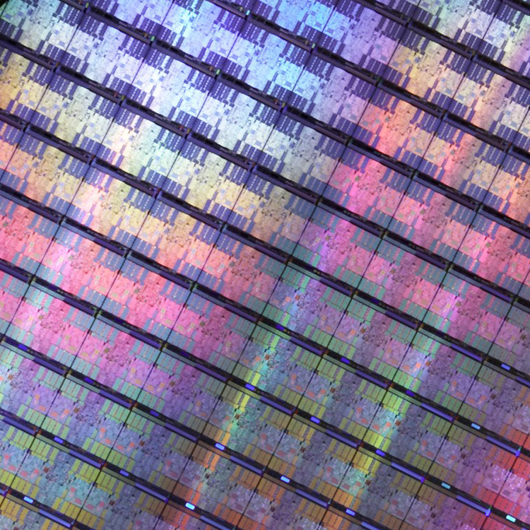
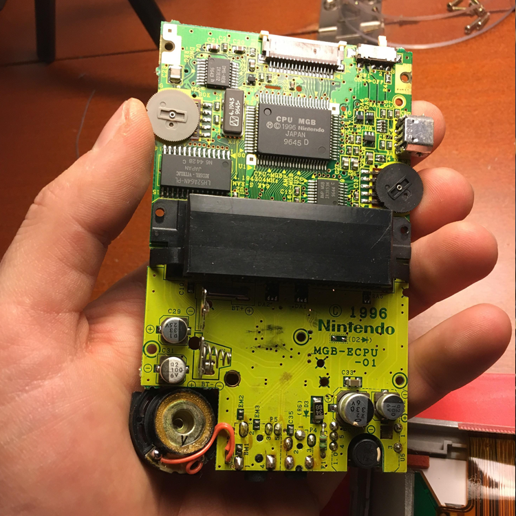
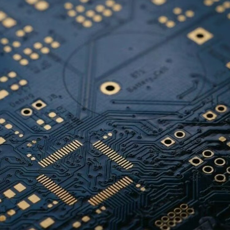
The color palette was inspired by integrated circuits as well as printed circuit boards similar to those used in the original Nintendo Game Boy and other mobile devices. The identity system is meant to be low-tech in nature, but it felt appropriate to use colors that resonate with ICs and PCBs used in high-end mobile technology.

Primary Color Palette

Green
hex: 93d500
rgb: 147/213/0
cmyk: 47/0/100/0

White
hex: ffffff
rgb: 255/255/255
cmyk: 0/0/0/0

Light Gray
hex: f5f5f5
rgb: 245/245/245
cmyk: 3/2/2/0

Middle Gray
hex: 979797
rgb: 151/151/151
cmyk: 43/36/36/1

Dark Gray
hex: 383838
rgb: 56/56/56
cmyk: 69/62/61/54

Black
hex: 000000
rgb: 0/0/0
cmyk: 0/0/0/98
Secondary Color Palette

Blue
hex: 1caedd
rgb: 28/174/221
cmyk: 71/11/4/0

Purple
hex: a959d8
rgb: 169/89/216
cmyk: 47/73/0/0

Red
hex: ff4343
rgb: 255/67/67
cmyk: 0/88/73/0

Orange
hex: ffb23a
rgb: 255/178/58
cmyk: 0/34/87/0
Branding
design assets
2D Design
print design, screen printing, t-shirt design, poster design, stationery, business cards

3D Design
3D Design - Live Action

Android Mediatecture
transmedia design, interaction design, interactive design, environmental design, motion design, 2D, 3D
This project was designed as an interactive spatial exhibit to unveil the new look and feel of the Android rebrand. The new logo feels personified almost like a household pet or trusty sidekick, so I wanted to give every person in the room an Android for themselves. Using a webcam and a 3D camera, an interactive program would track the amount of people in the room and render the same amount of Androids inside the projected Android exhibit. Every time a new person walks into the exhibit an Android leaves and brings back another friend.
Web Design
Selected Works
Hummus Labsbranding, creative direction, transmedia design, marketing, ada compliance

Smartracbranding, creative direction, transmedia design, marketing
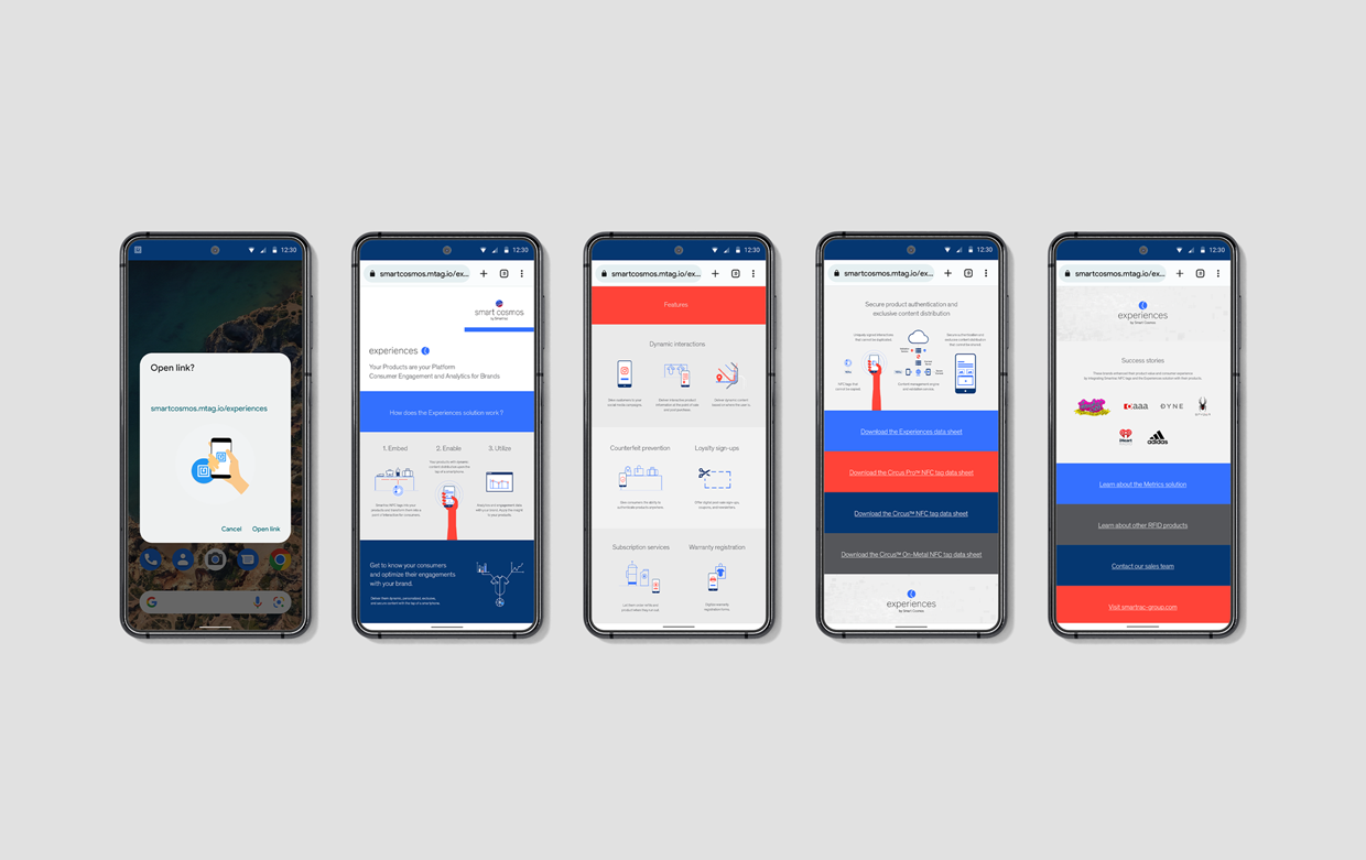
Smart Cosmosbranding, creative direction, transmedia design, marketing
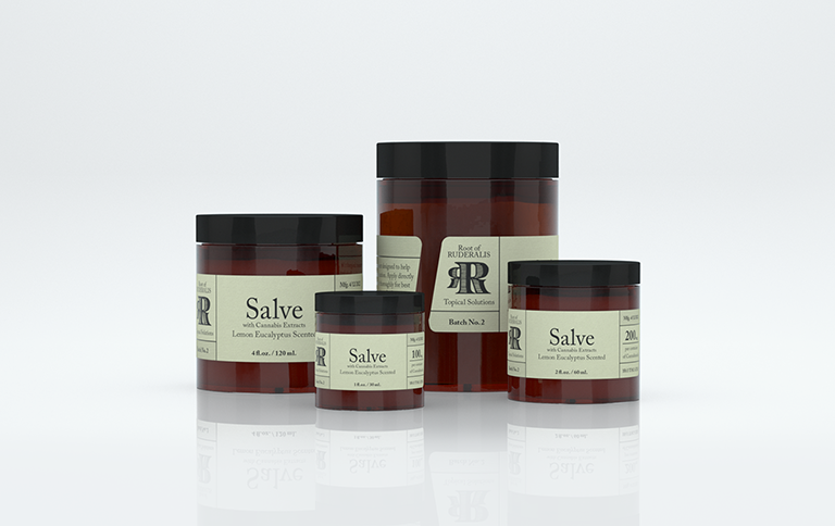
Root of Ruderalisbranding, creative direction, transmedia design, marketing
Androidbranding, creative direction, transmedia design, marketing
Juiceboxbranding, creative direction, transmedia design, marketing, entertainment
©2024 murphy_armitage