Hummus Labs
creative direction, transmedia design, corporate identity, branding, print, web, screen, photography, marketing, accessibility, ada compliance
The Hummus Labs brand was designed with the goals of accessibility, legibility, and future expandability. The client wanted his Mediterranean restaurant's branding to reflect a minimal, sterile, comfortable, and timeless look and feel, all while being easy to read and expandable with the addition of other locations. As this particular restaurant concept was a passion project for him it was important to signify the expansion of his brand in a meaningful way. Another key element of the brand identity was inclusion for those with visual impairments. Utilizing high contrast and minimal color palette we focused on a highly legible logotype and an accessible user experience with his brand elements at the forefront.
Branding
concept development
Brand Goals
attributes
accessible
legible
expandable
minimal
sterile
comfortable
look & feel
timeless
clinical
laboratory
mathematics
physics
chemistry
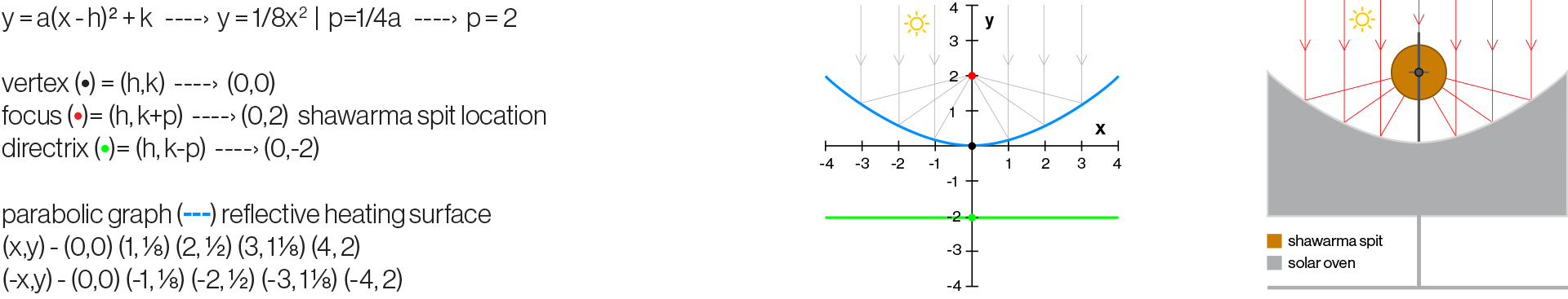
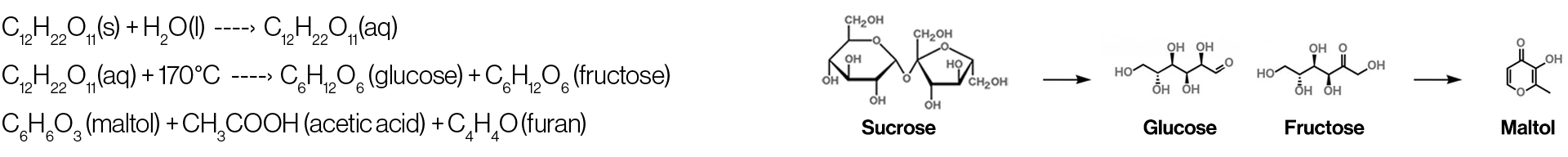
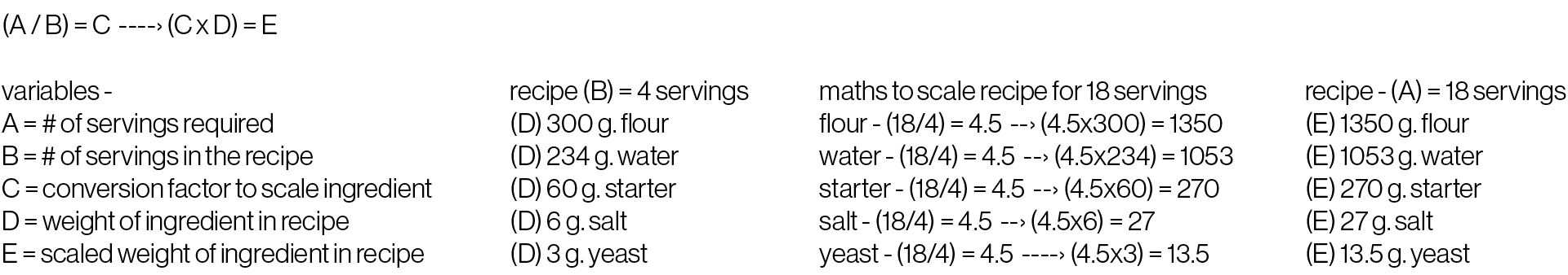
The Hummus Labs brand concept was created with the intention of being a laboratory for Chef Joseph Badaro to experiment with Lebanese inspired Mediterranean cuisine. When considering Mediterranean food most overlook Lebanese cuisine and think of Greek, Egyptian, Turkish, or Israeli food. Hummus Labs seeks to change the perception of Mediterranean food in the market by elevating traditional Lebanese cuisine with modern flavors and cooking techniques. Taking inspiration from restaurant laboratory experiments we incorporated mathematical and scientific design language into the branding.
Brand Inspiration
parabolic equation - shawarma solor oven
chemical balancing - caramelization of sugar
recipe scaling arithmetic - by serving size
Logotype DNA
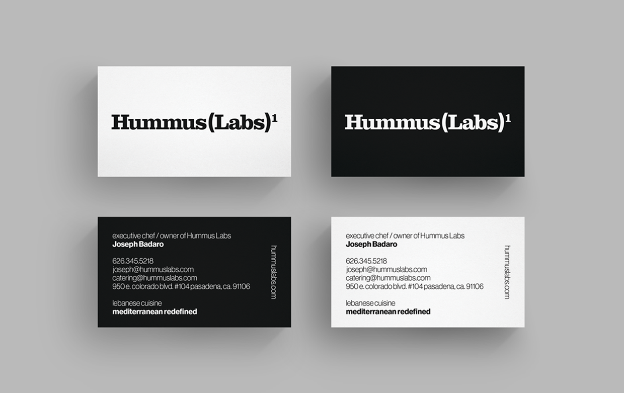
The Hummus Labs logotype was created with Clarendon and Neue Haas Grotesk. The two fonts have a bold assertive appearance while providing a timeless look that conveys cleanliness, elegance, and simplicity. When the high contrast and abstract shapes of Clarendon are combined with the minimalist and geometric shapes of Neue Haas Grotesk an objective yet humanistic characteristic is achieved.
Clarendon Bold
Slab Serif, Egyptian
Neue Haas Grotesk Bold
Sans Serif, Neo-grotesque
Brand Concept
The “(Labs)1” portion of the brand name is a take on the practical application of parentheses, superscripts, and subscripts used in the maths of chemistry, physics, and laboratory experiments. The superscript 1 is meant to signify the first restaurant location while providing an avenue for the sequential addition of 2, 3, and so forth as the owner opens more locations.

Branding
identity + guidelines
Brand Usage
The Hummus Labs logotype is only reproduced in black and white. To create the highest contrast ratio of the brand possible a black on white or white on black color scheme is preferred. The logo may also be reproduced over secondary light gray, wood, white subway tile, and black subway tile listed in the brand textures.
When referring to the brand in written form, drop the parenthesis and superscript 1. Ex. Hummus Labs redefines the meaning of Mediterranean food with their Lebanese inspired cuisine.

Black on White
White on Black

Black on White Subway Tile Texture
White on Black Subway Tile Texture
White on Secondary Light Gray
White on Wood Texture
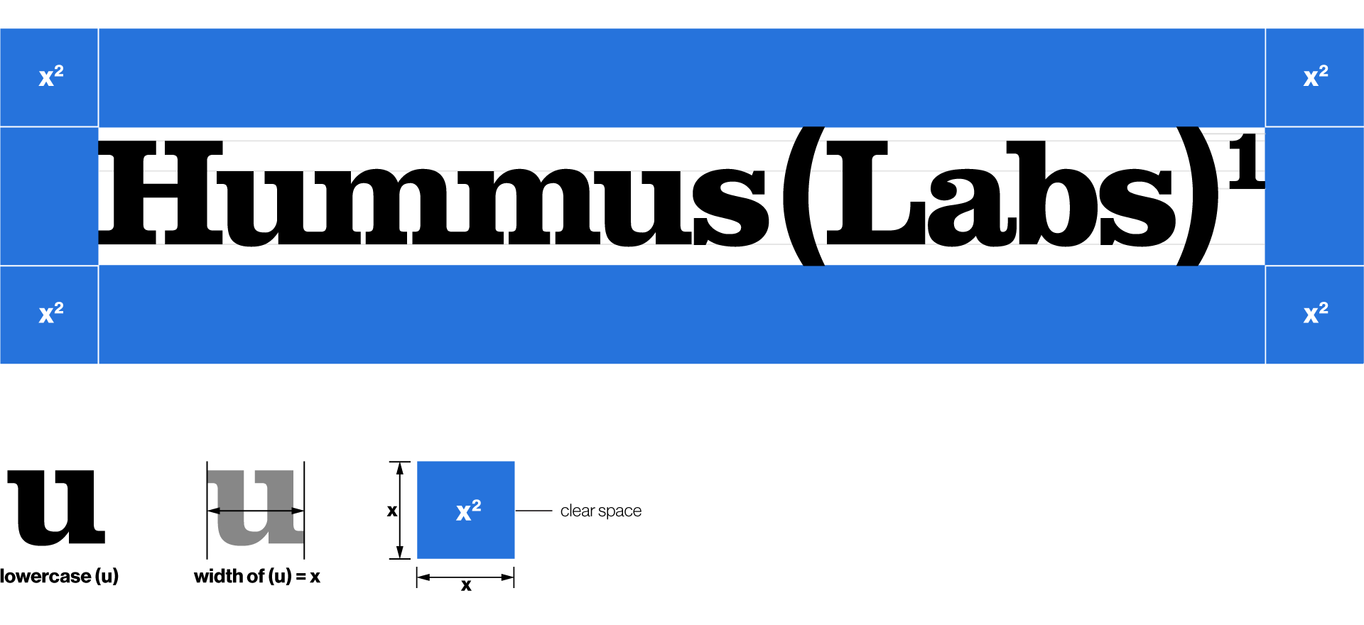
Brand Clear Space
The clear space is found by measuring the width from serif to serif of the lowercase Clarendon “u” in the Hummus Labs logotype. Add the measurement above and below the Neue Haas Grotesk parenthesis “()”, to the left of the serifs in the uppercase Clarendon “H”, and to the right of the serif in the superscript “1”. This clear space measurement can be adapted to any reproduction size of the logotype.
Brand Clear Space - Print Example

Brand Clear Space - Web Example

Brand Typography
With a focus on accessibility at the forefront of all brand interactions, Hummus Labs required a typeface with a large character set in a variety of weights and multi-language support. Neue Haas Grotesk was chosen as the typeface to be used in all typographic applications of the brand as it met all three requirements. To bring primary focus on headline elements and menu items the weight of 75 Bold is to be used in all typesetting applications. All supporting typographic elements are to be typeset in the weight of 45 Light and 46 Italic Light.
Neue Haas Grotesk Light
Sans Serif, Neo-grotesque
Neue Haas Grotesk Bold
Sans Serif, Neo-grotesque
Neue Haas Grotesk - 45 Light
abcdefghijklmnopqrstuvwxyz
ABCDEFGHIJKLMNOPQRSTUVWXYZ
1234567890(,./!@#$%^&*\-_+=)
Neue Haas Grotesk - 46 Light Italic
abcdefghijklmnopqrstuvwxyz
ABCDEFGHIJKLMNOPQRSTUVWXYZ
1234567890(,./!@#$%^&*\-_+=)
Neue Haas Grotesk - 75 Bold
abcdefghijklmnopqrstuvwxyz
ABCDEFGHIJKLMNOPQRSTUVWXYZ
1234567890(,./!@#$%^&*\-_+=)
Typography - Web Guidelines - px
H1 - 96/100
Neue Haas Grotesk 75 Bold
H2 - 50/64
Neue Haas Grotesk
75 Bold
H3 - 24/48 Neue Haas Grotesk 75 Bold
H4 - 24/48 Neue Haas Grotesk 75 Bold
P - 18/32 Neue Haas Grotesk 45 Light
P - 18/32 Neue Haas Grotesk 45 Light
Typography - Print Menu Guidelines - pt
Headings, Menu Sections
16/18 - Neue Haas Grotesk 75 Bold
Menu Items
12/14 - Neue Haas Grotesk 75 Bold
Paragraph, Supporting Text
10/14 - Neue Haas Grotesk 45 Light
Paragraph, Supporting Text
10/14 - Neue Haas Grotesk 46 Light Italic
Typography - Screen Menu Guidelines - pt
Headings, Menu Sections
40/48 - Neue Haas Grotesk 75 Bold
Menu Items
26/30 - Neue Haas Grotesk 75 Bold
Paragraph, Supporting Text
24/30 - Neue Haas Grotesk 45 Light
Paragraph, Supporting Text
24/30 - Neue Haas Grotesk 46 Light Italic
Brand Colors / Textures
A minimal color palette was created as a way to make the brand more accessible in practical applications. With consideration for visual impairments at the forefront of the brand experience we focused on the single color blue, plus black, white, and gray tones for the color palette. Black and white being the primary color palette. A series of textures utilized in the interior design of the restaurant was also added for safe use with the identity. Textures should be used sparingly as a graphical element.
Color Palette

Primary - Black
hex: 0c0c0c
rgb: 12/12/12
cmyk: 0/0/0/98

Primary - White
hex: ffffff
rgb: 255/255/255
cmyk: 0/0/0/0

Secondary - Light Gray
hex: f6f6f6
rgb: 246/246/246
cmyk: 0/0/0/2
pantone: Cool Gray 1C

Secondary - Mid Gray
hex: adaeaf
rgb: 173/174/175
cmyk: 33/26/26/0
pantone: Cool Gray 6C

Secondary - Dark Gray
hex: 646d68
rgb: 100/101/106
cmyk: 61/52/49/20
pantone: 425 C

Tertiary - Blue
hex: 2673dc
rgb: 38/115/220
cmyk: 80/55/0/0
pantone: 285 C
Texture Palette
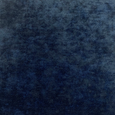
Velvet Fabric
color: Navy Blue
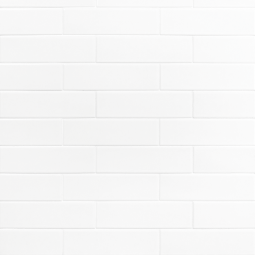
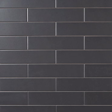
Subway Tile
color: Black, White
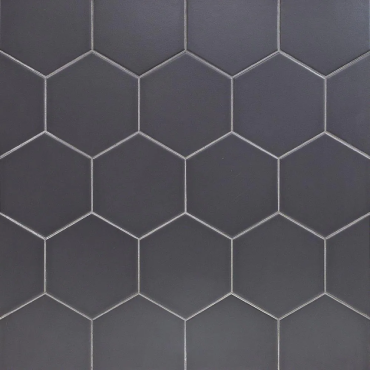
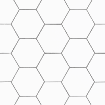
Hexagon Tile
color: Black, White

Stainless Steel

Cement
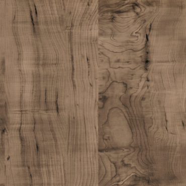
Wood
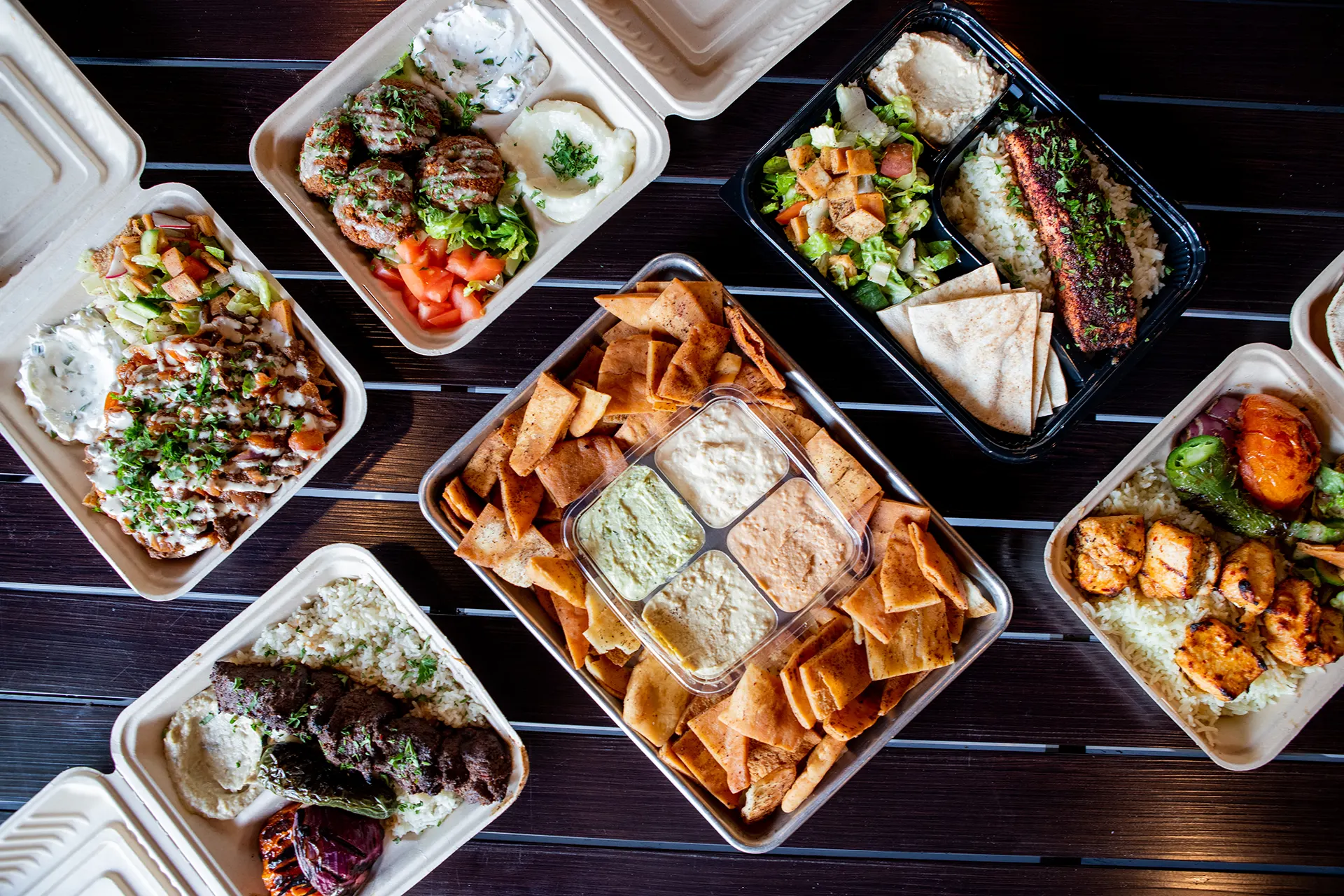
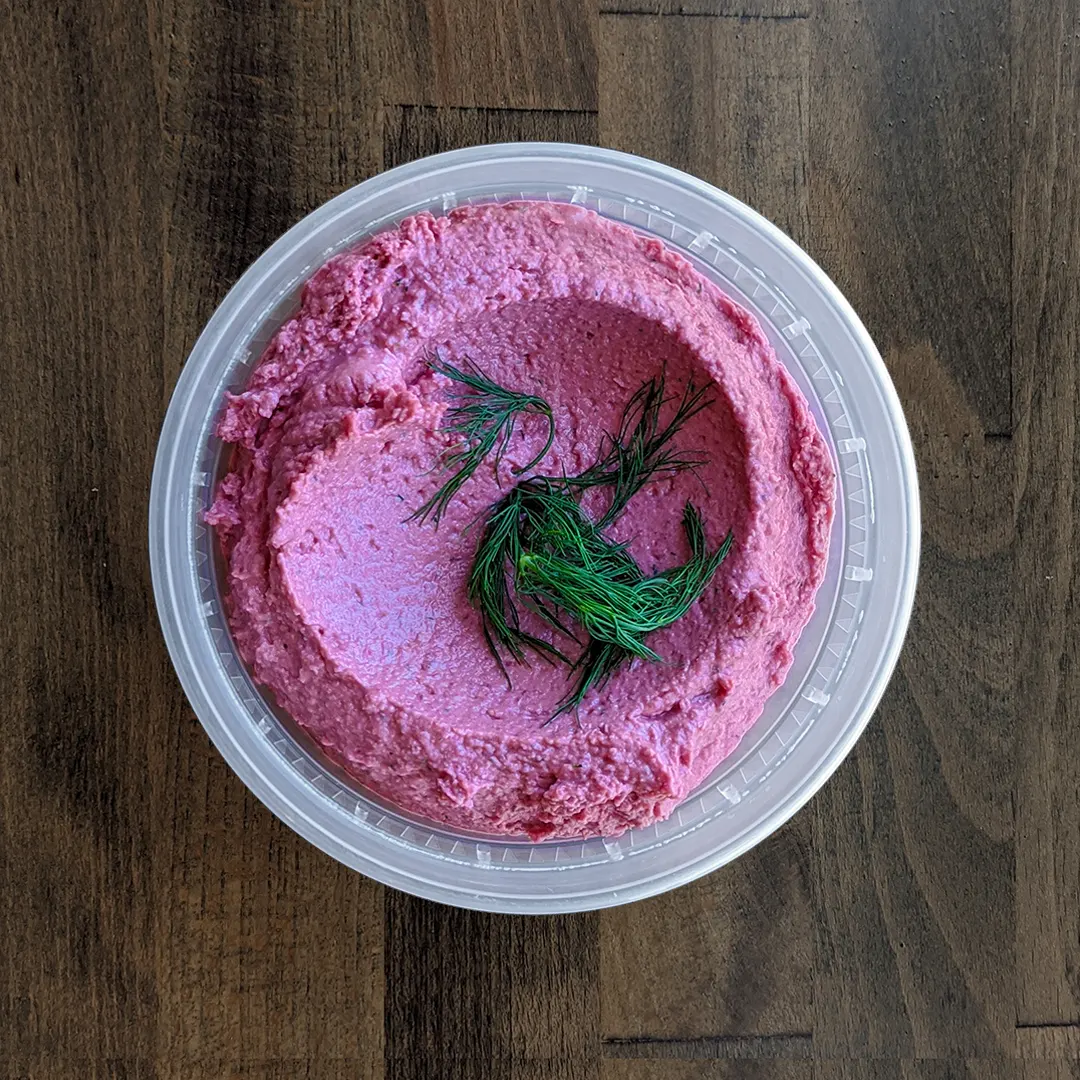
Brand Photography
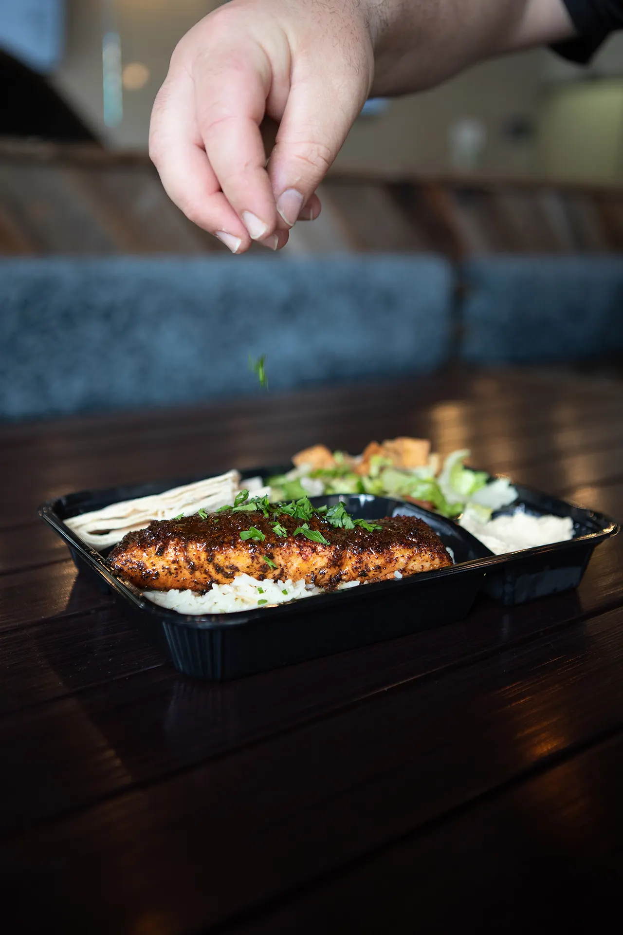
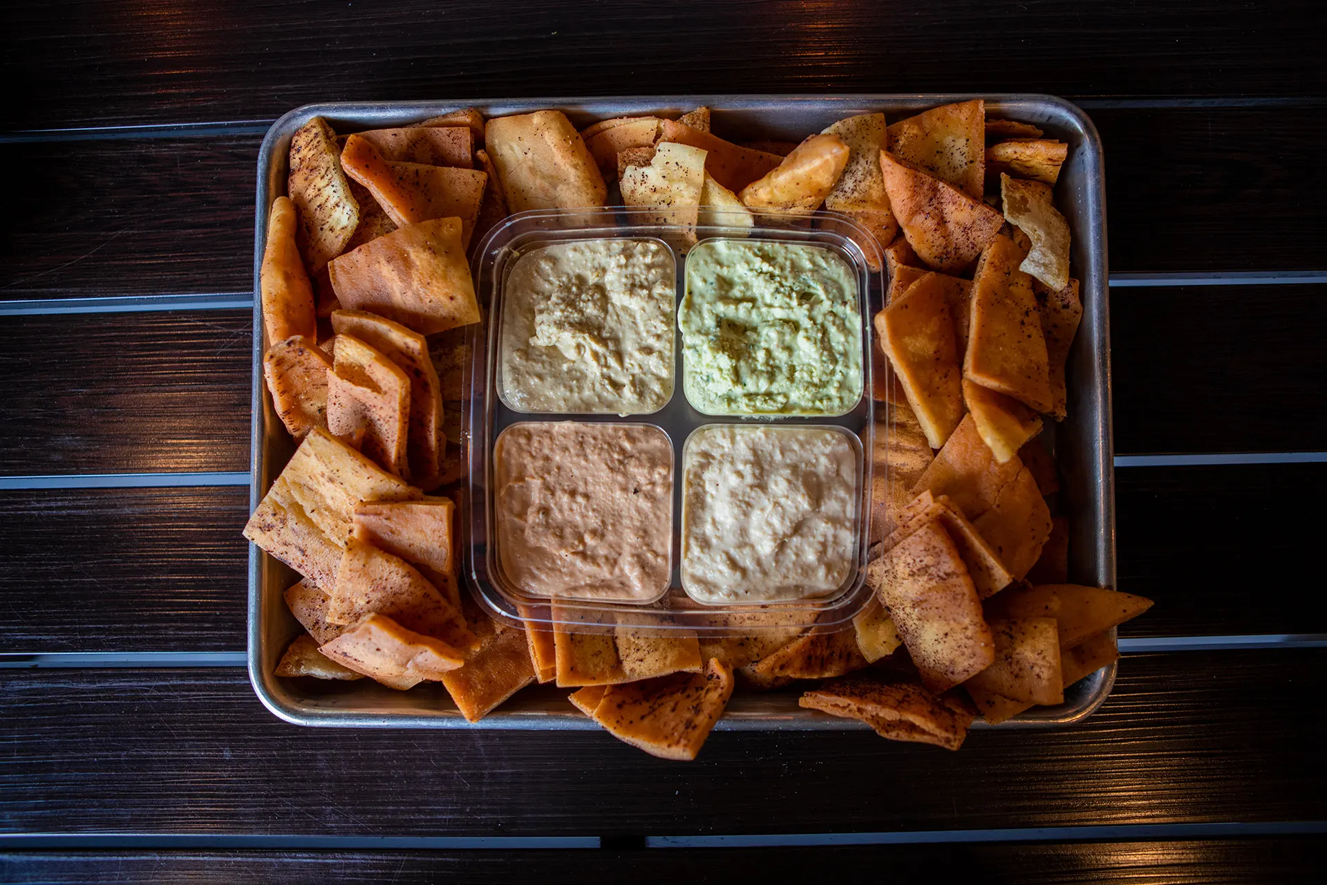
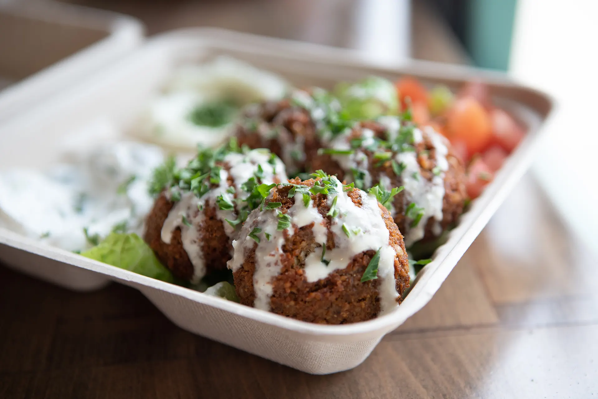
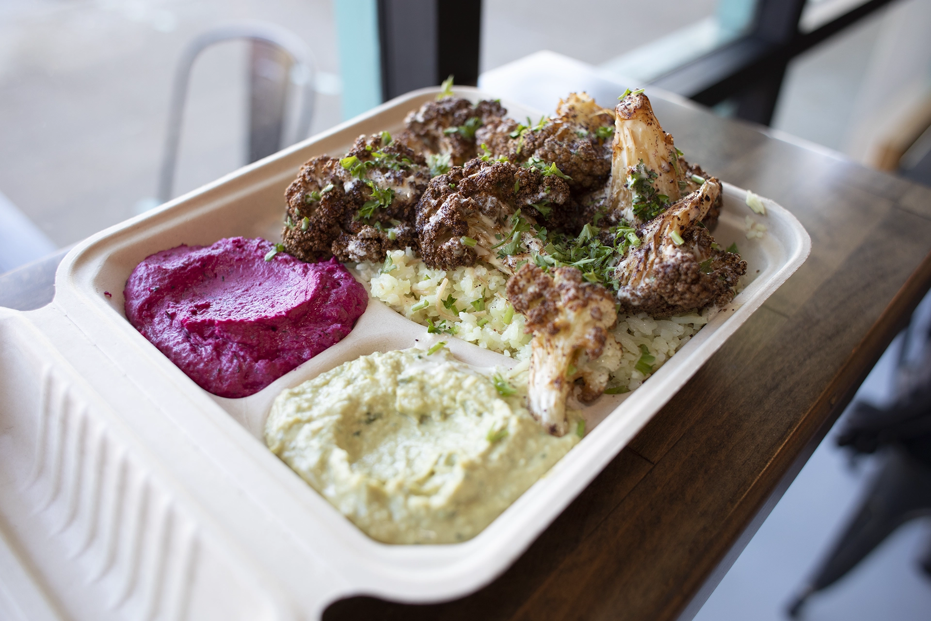
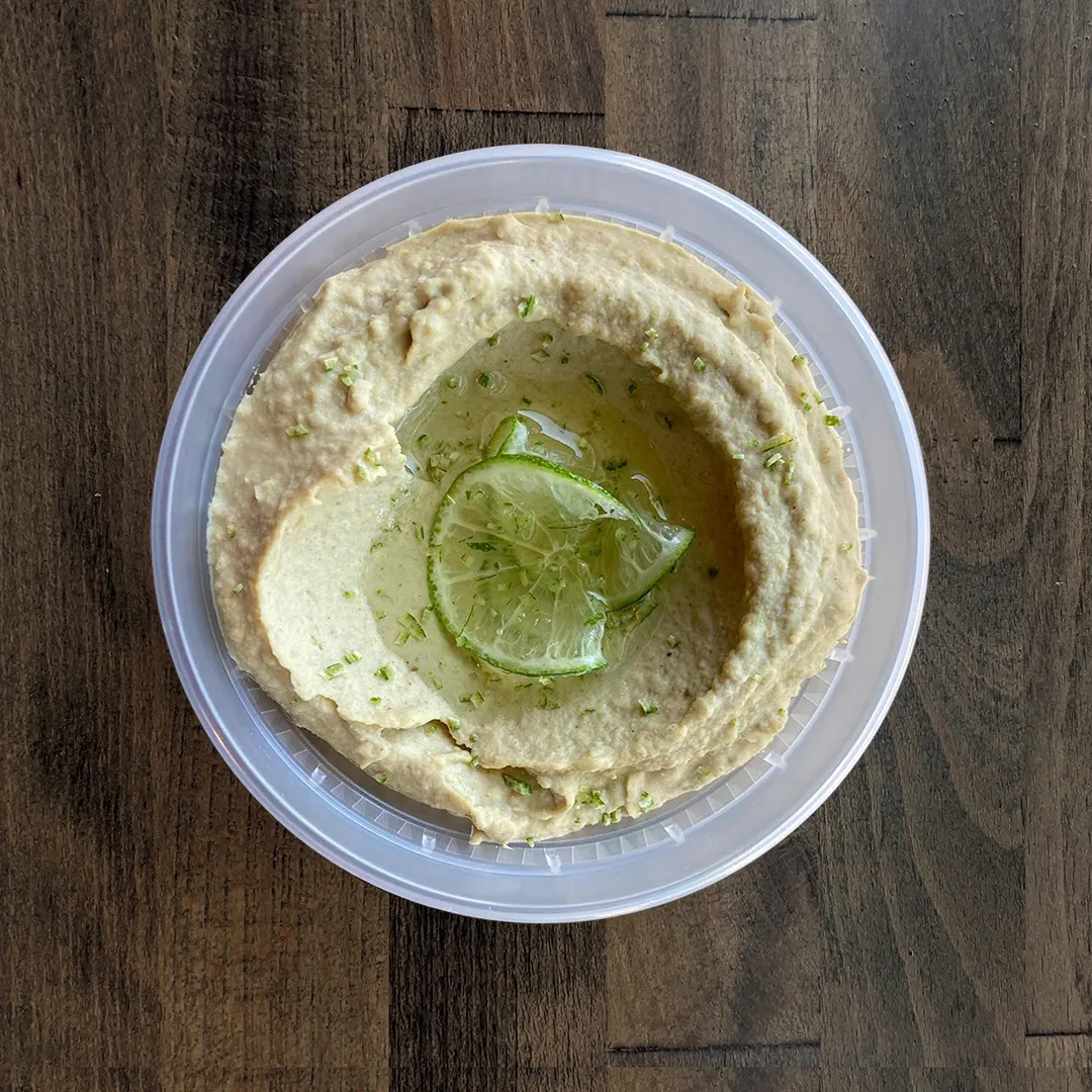
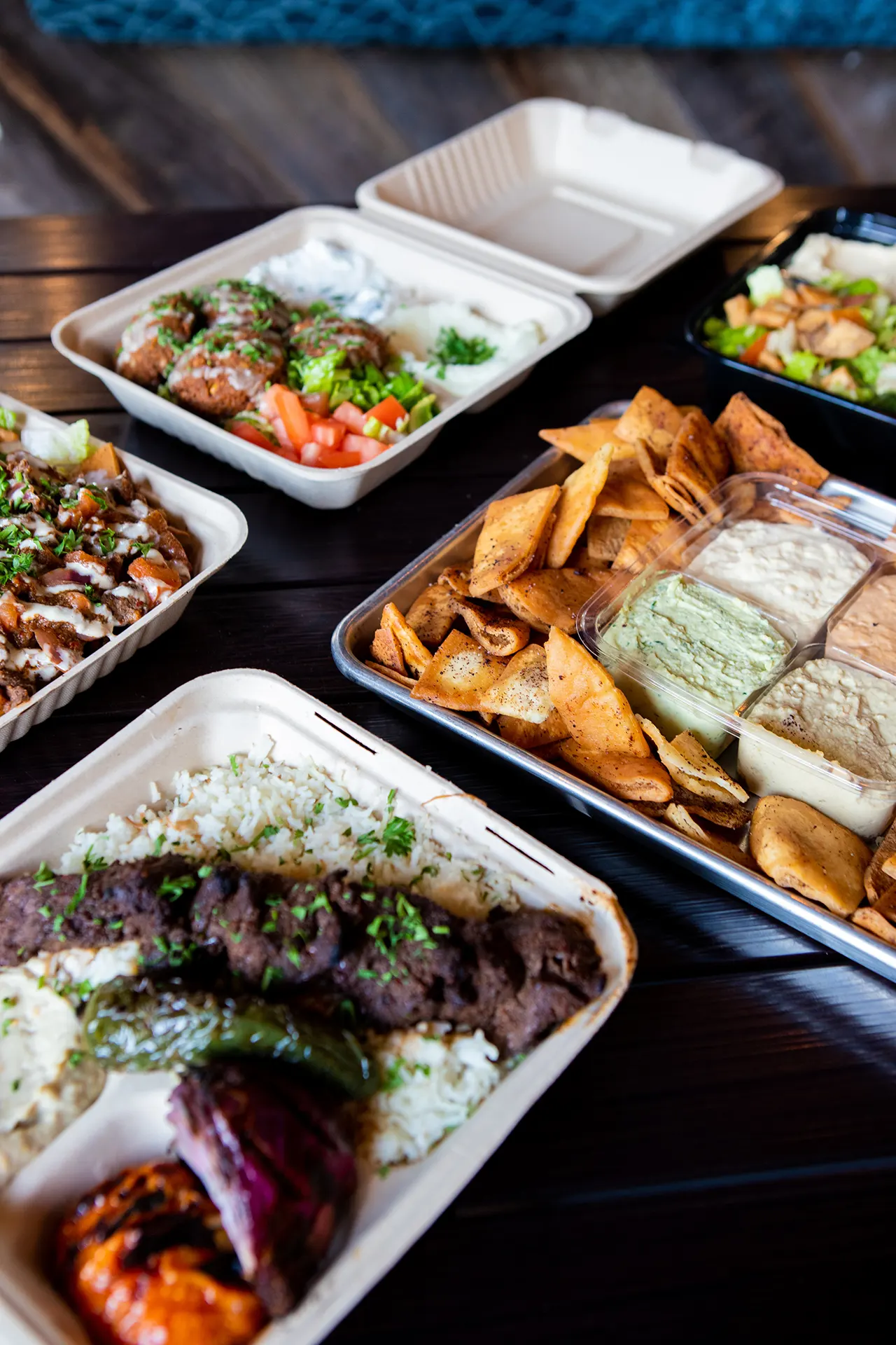
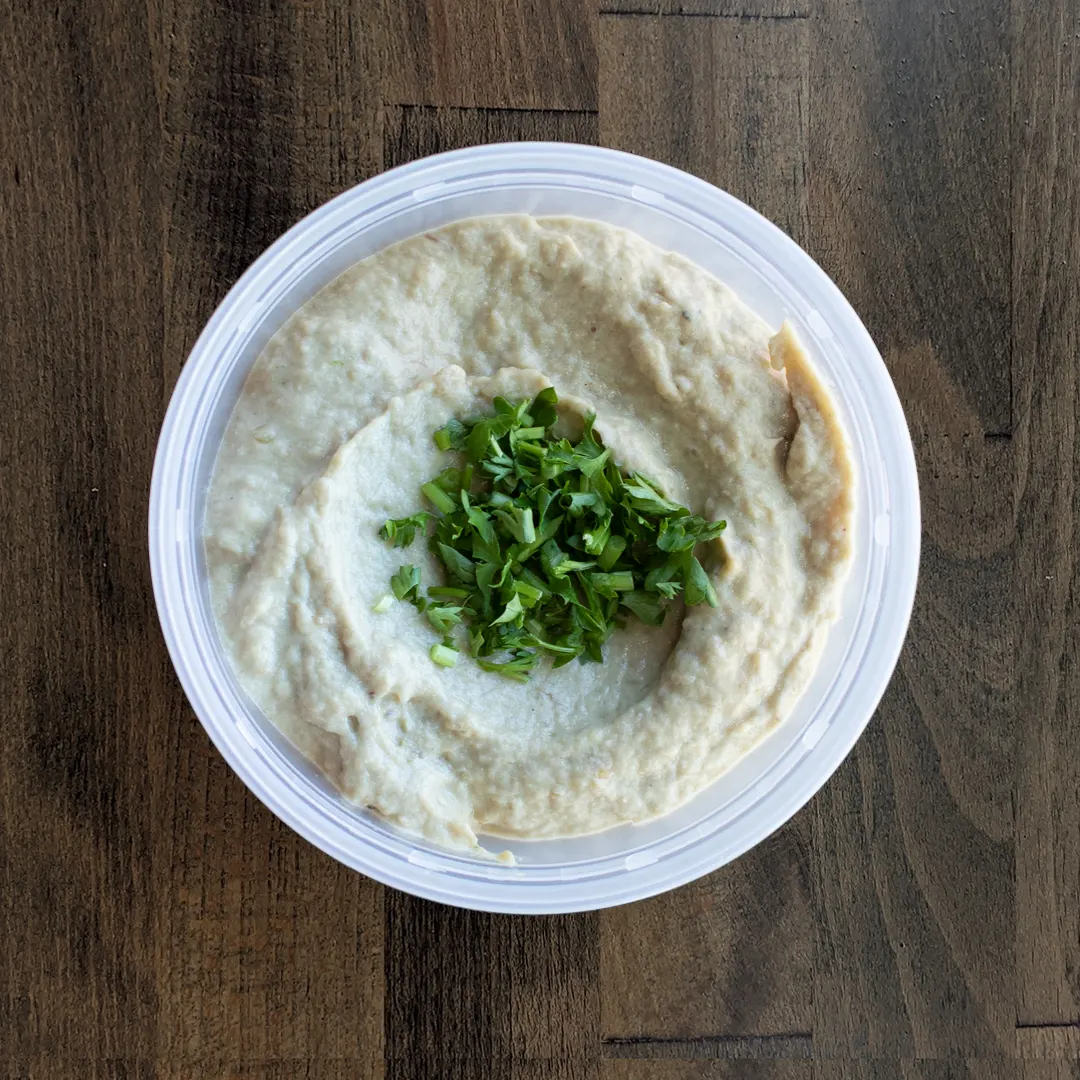
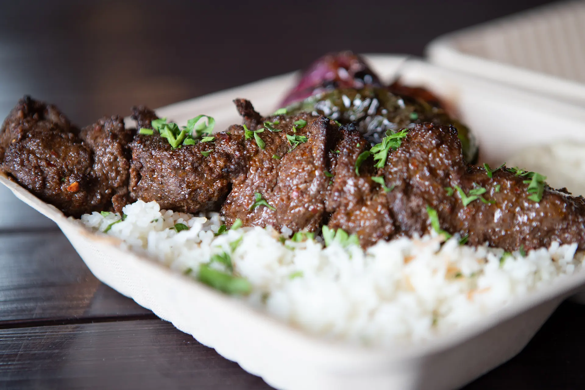
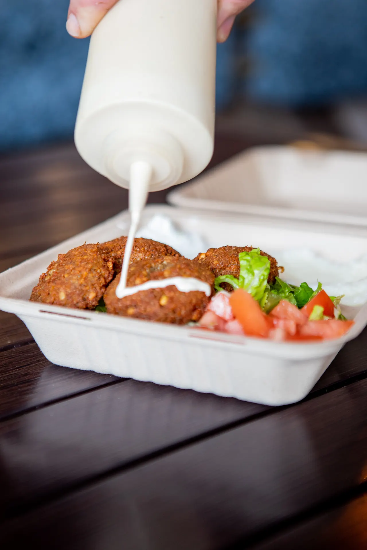
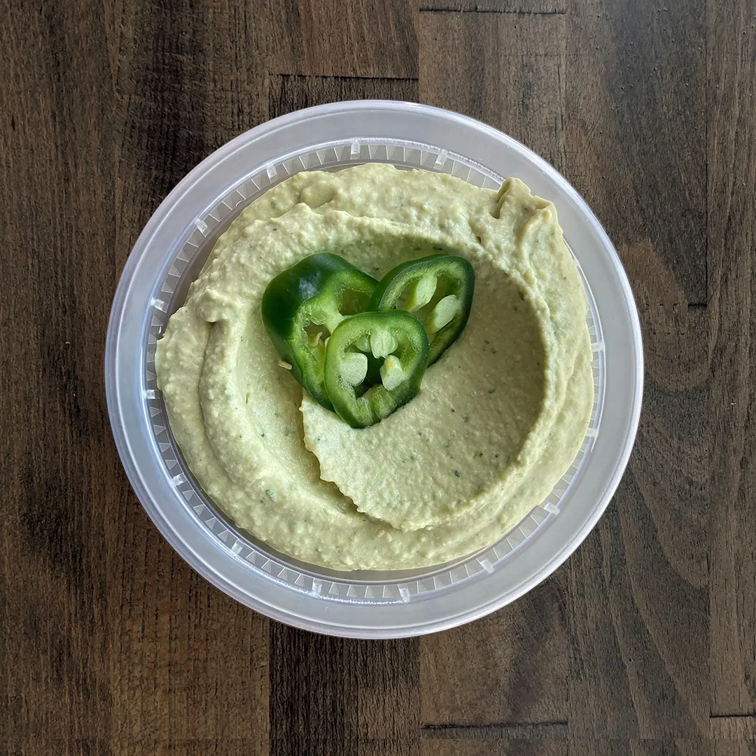
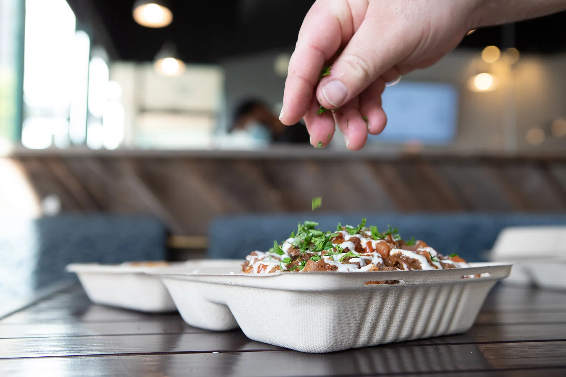
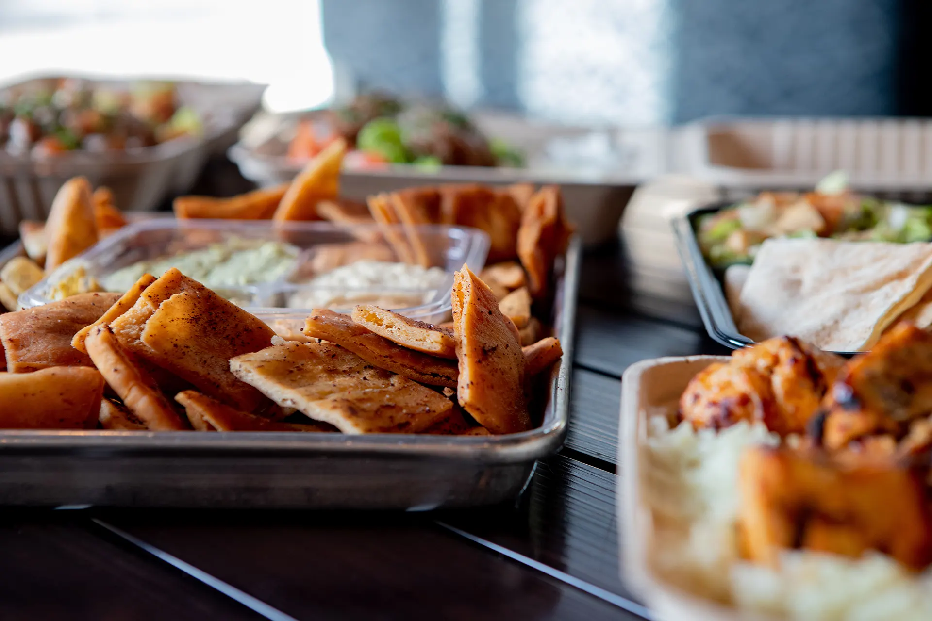
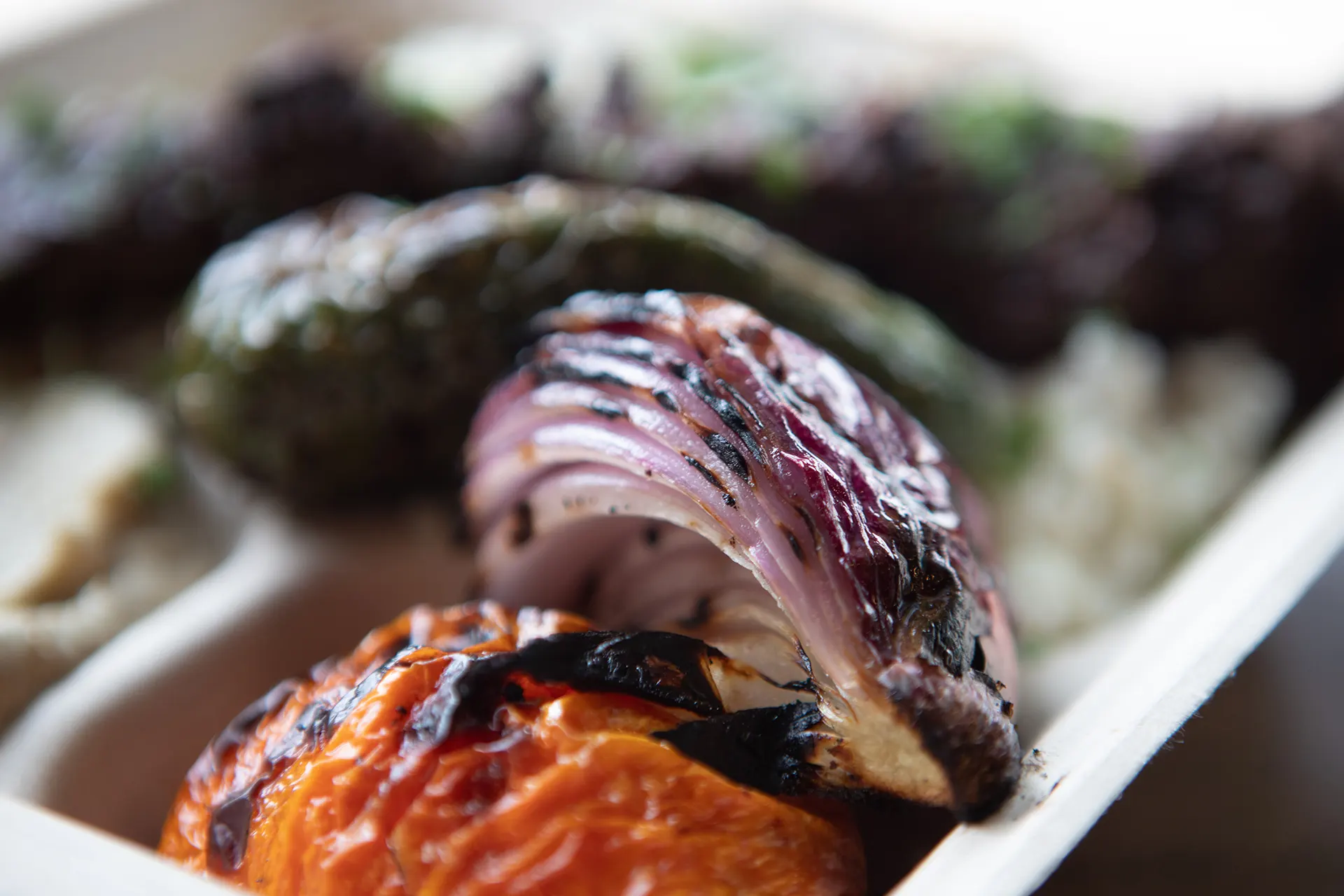
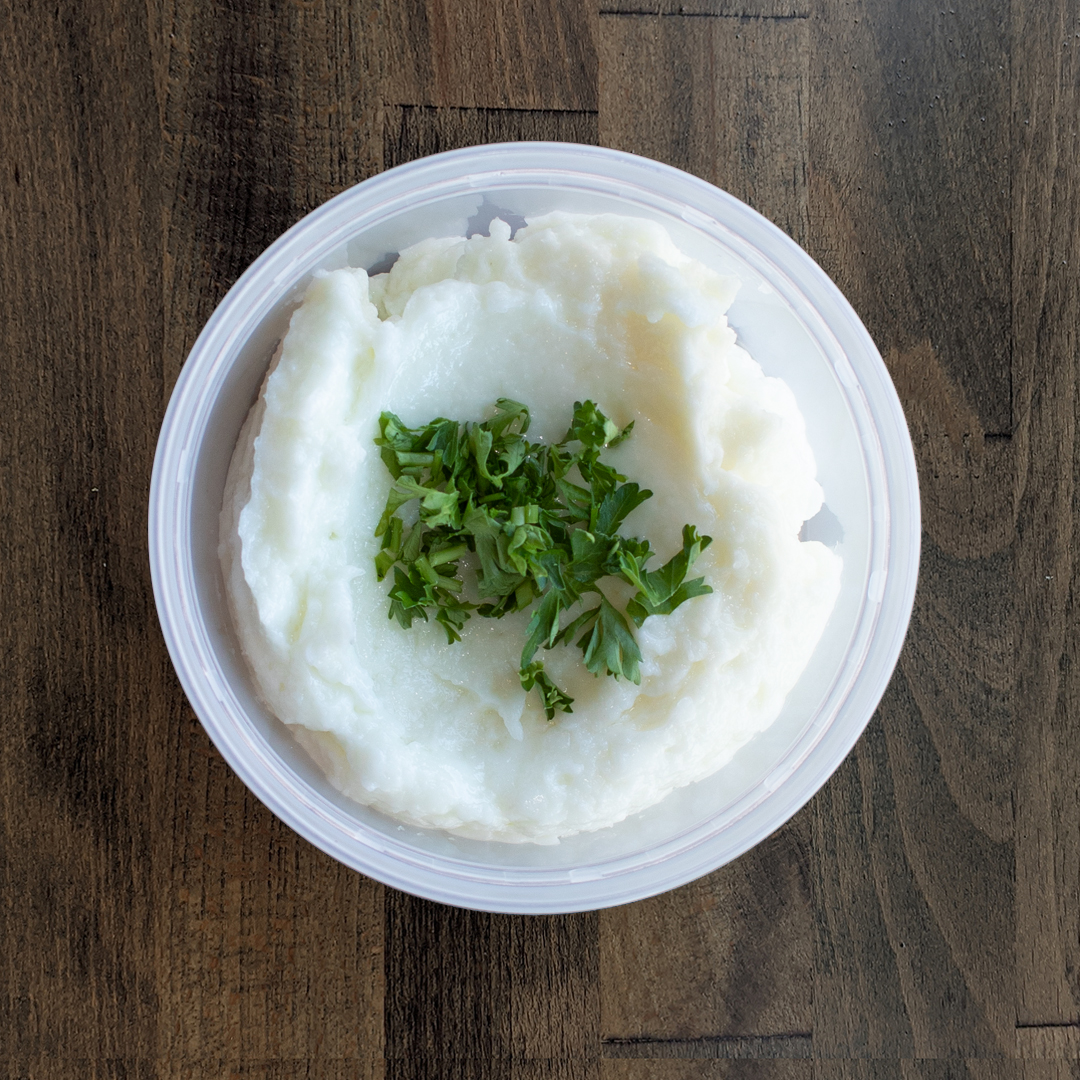
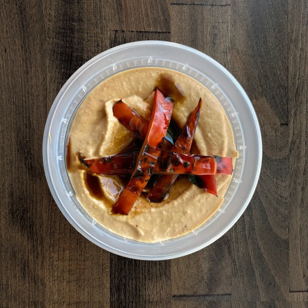
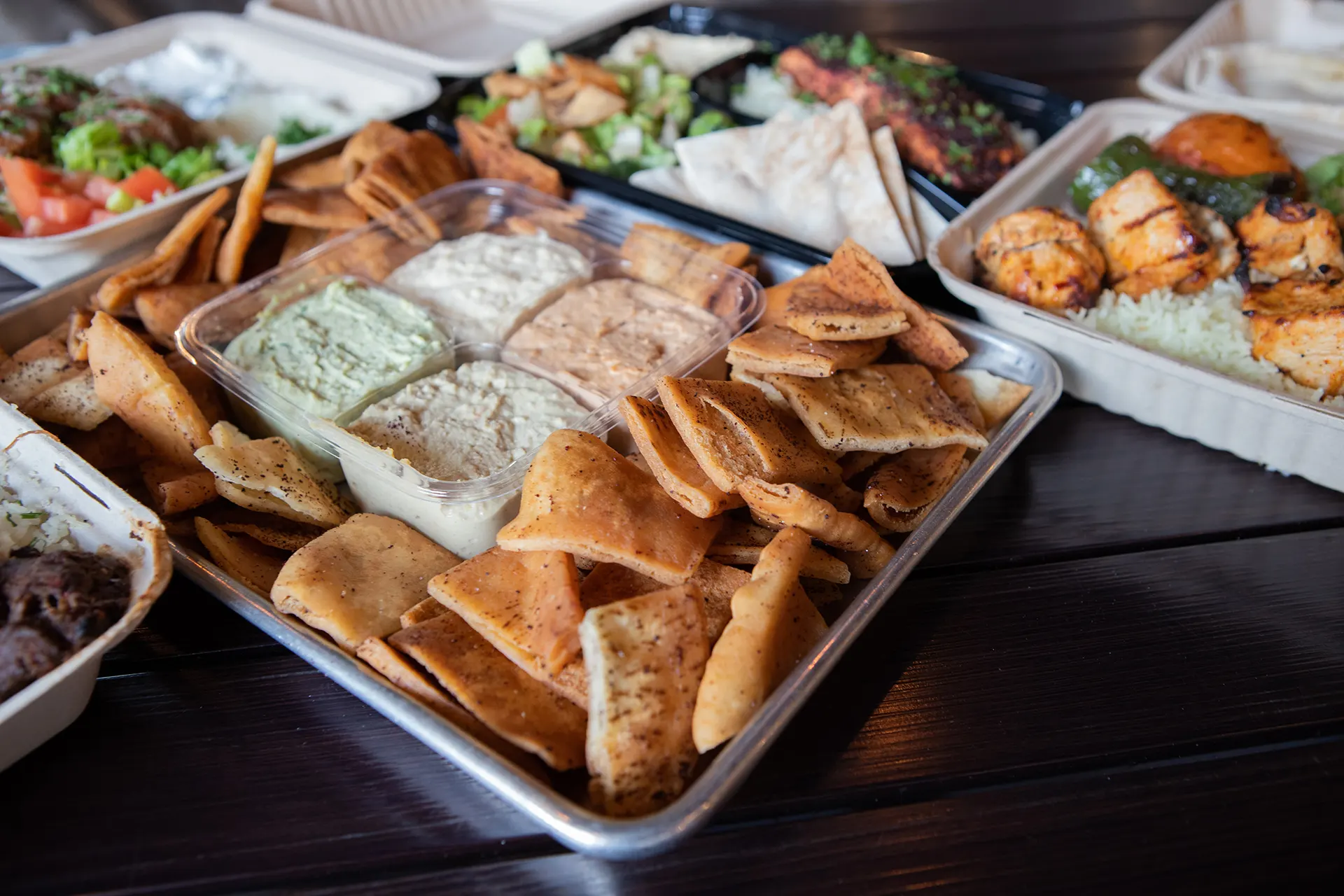
Hummus Labs brand photographs must be taken inside the restaurant during the daytime when the most natural lighting fills up the room. All menu items should be depicted as they would appear if you were inside the restaurant eating the dish yourself. The platters and sides must be photographed in the same containers the dish will be served in. Framing of the photographs should be focused on the food with low depth of field, making use of overhead shots and dynamic angles with the dish taking focal point.
Print Design
brand assets
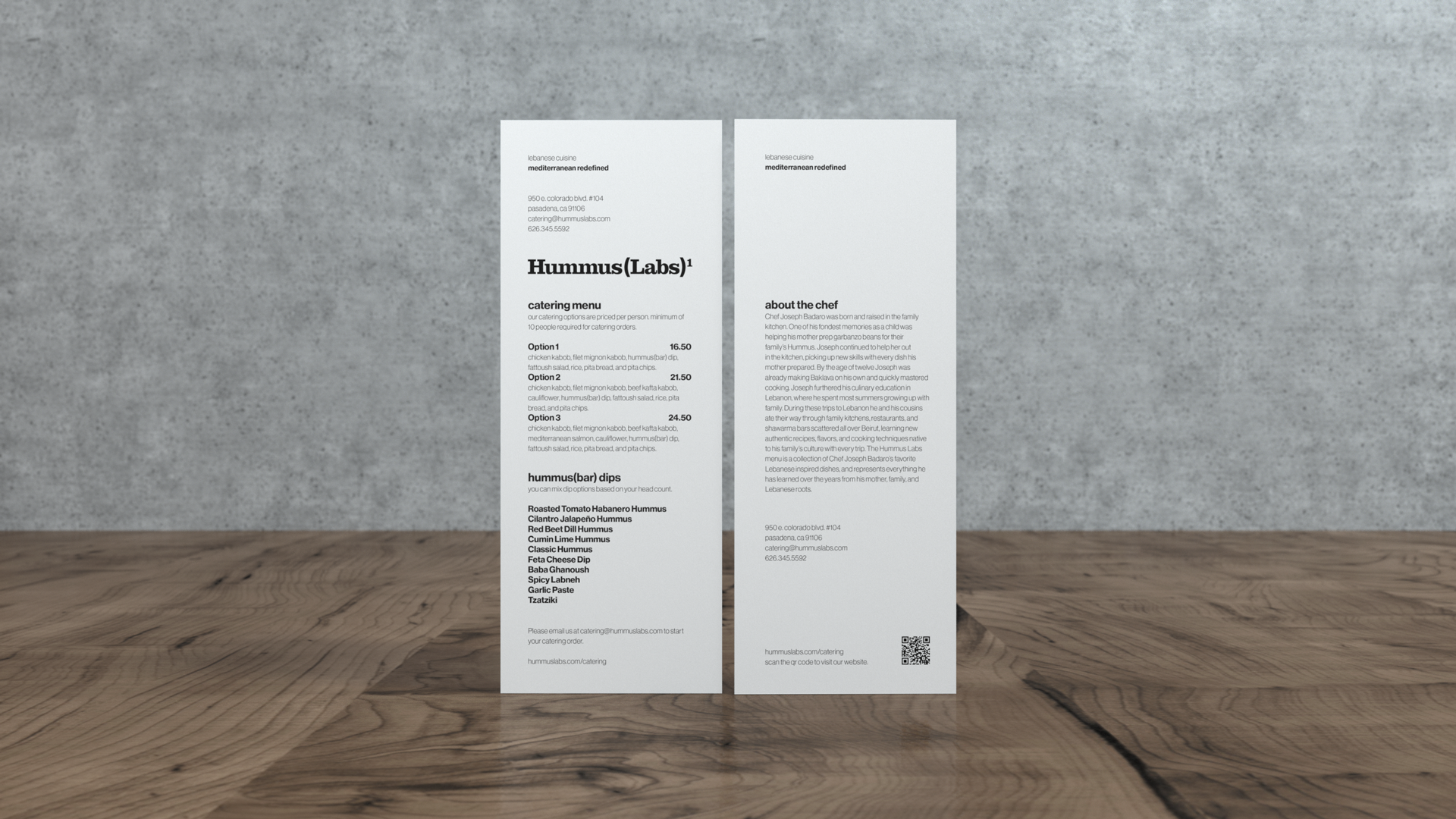
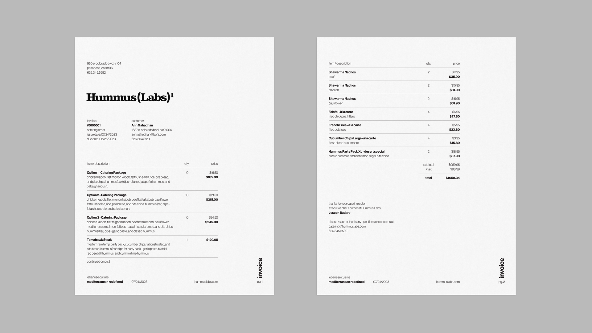
Paper Menus
branding, print design
The Mediterranean diet is one of the most healthy in the world so it felt appropriate to go with tall and slender design for Hummus Labs menu. The brand menus are printed in only black on Neenah Classic Crest - Antique Grey Smooth paper. The Hummus Labs menu is printed on the 24 lb. writing stock, the Catering and Chef’s Table menus are printed on 80 lb. cover stock.


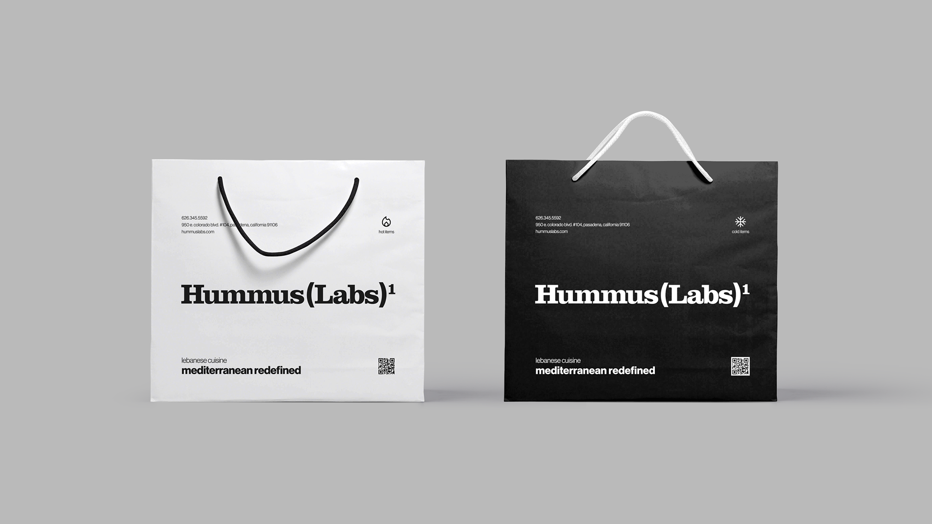
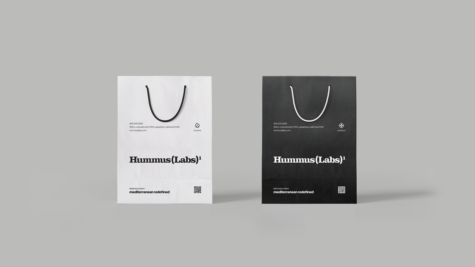
To-Go Bags
branding, print design, flexography
When grabbing to-go food no one enjoys the experience of hot items going cold and vice versa. So we created two to-go bag designs in order to separate cold and hot items with the ultimate goal of keeping the whole order at the intended temperature. The black bag is for cold items and the white bag is for hot items. We created them in two sizes to support large and small orders while minimizing paper waste.
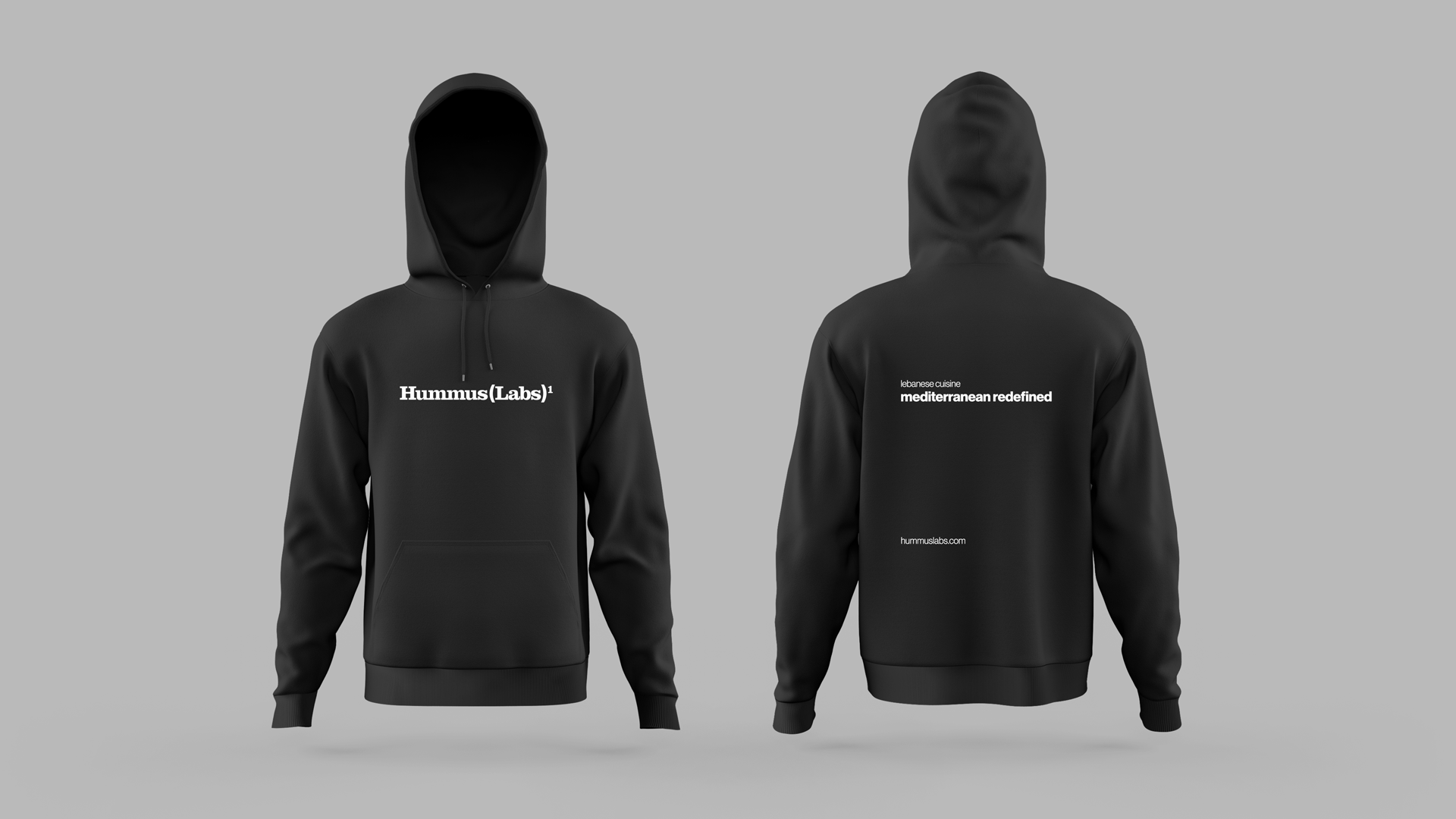
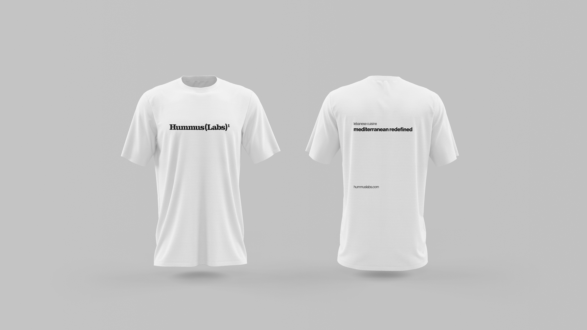
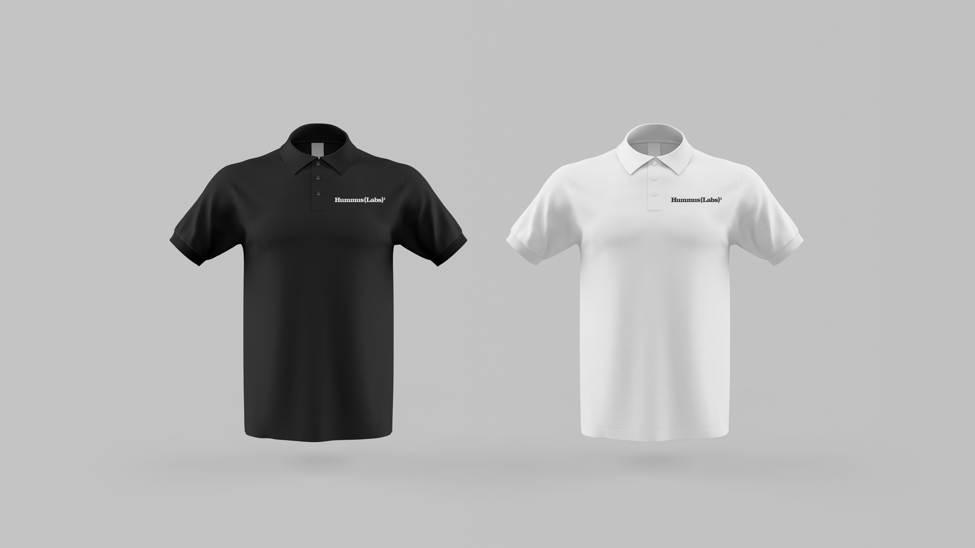
Employee Attire
branding, print design, screen printing
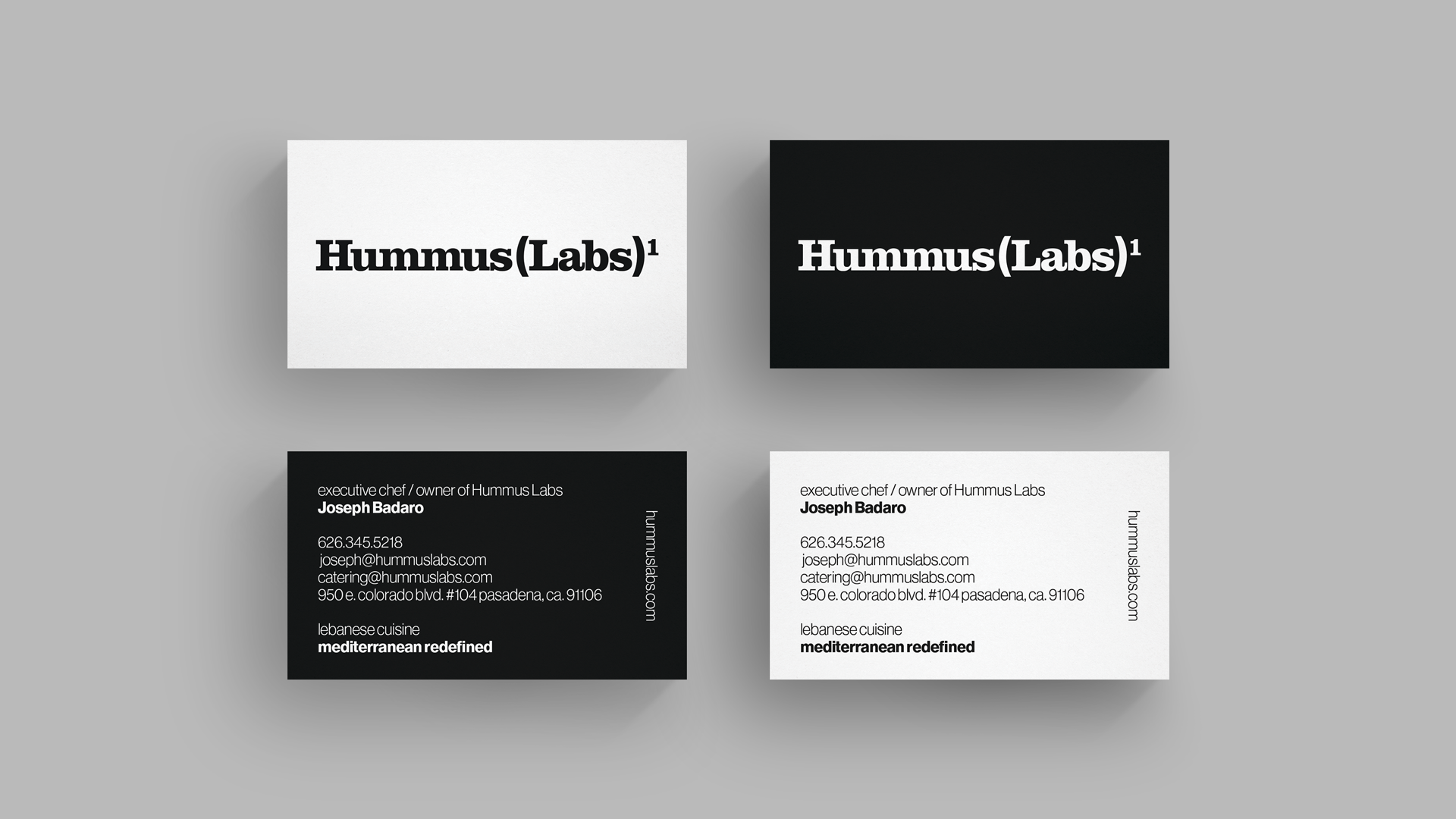
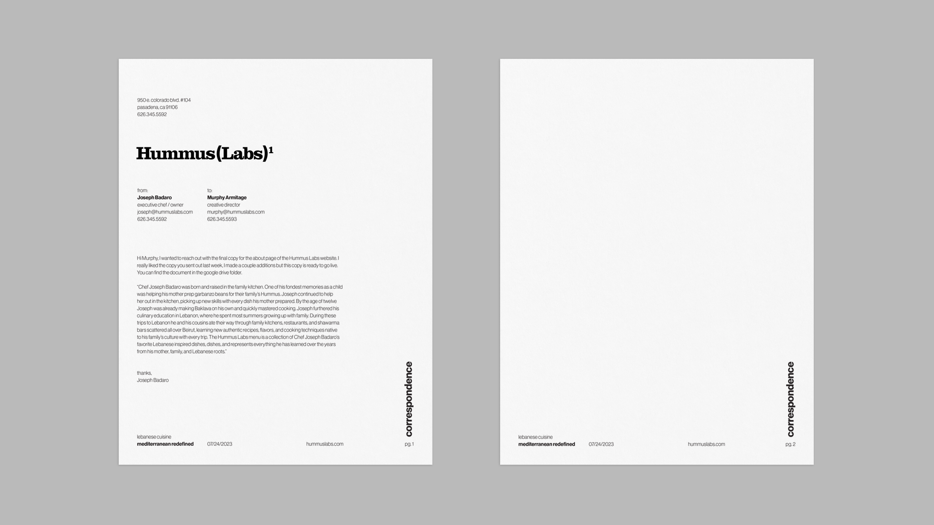
Stationery
branding, print design
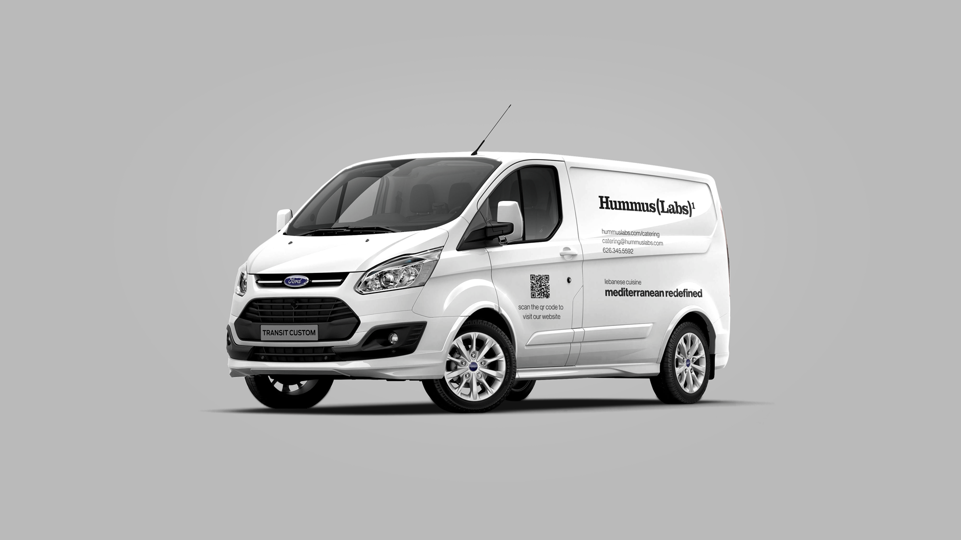
Catering Van
branding, print design, vinyl wrap
Screen Design
brand assets
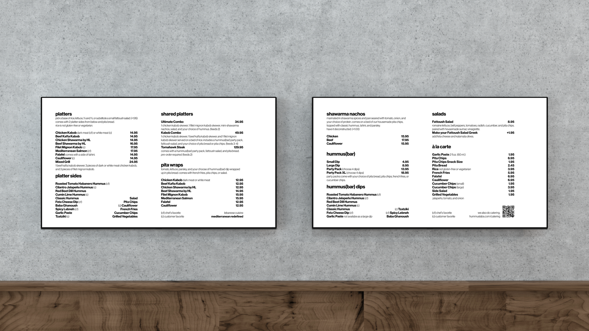
Screen Menus
branding, screen design.
UI / UX Design
website
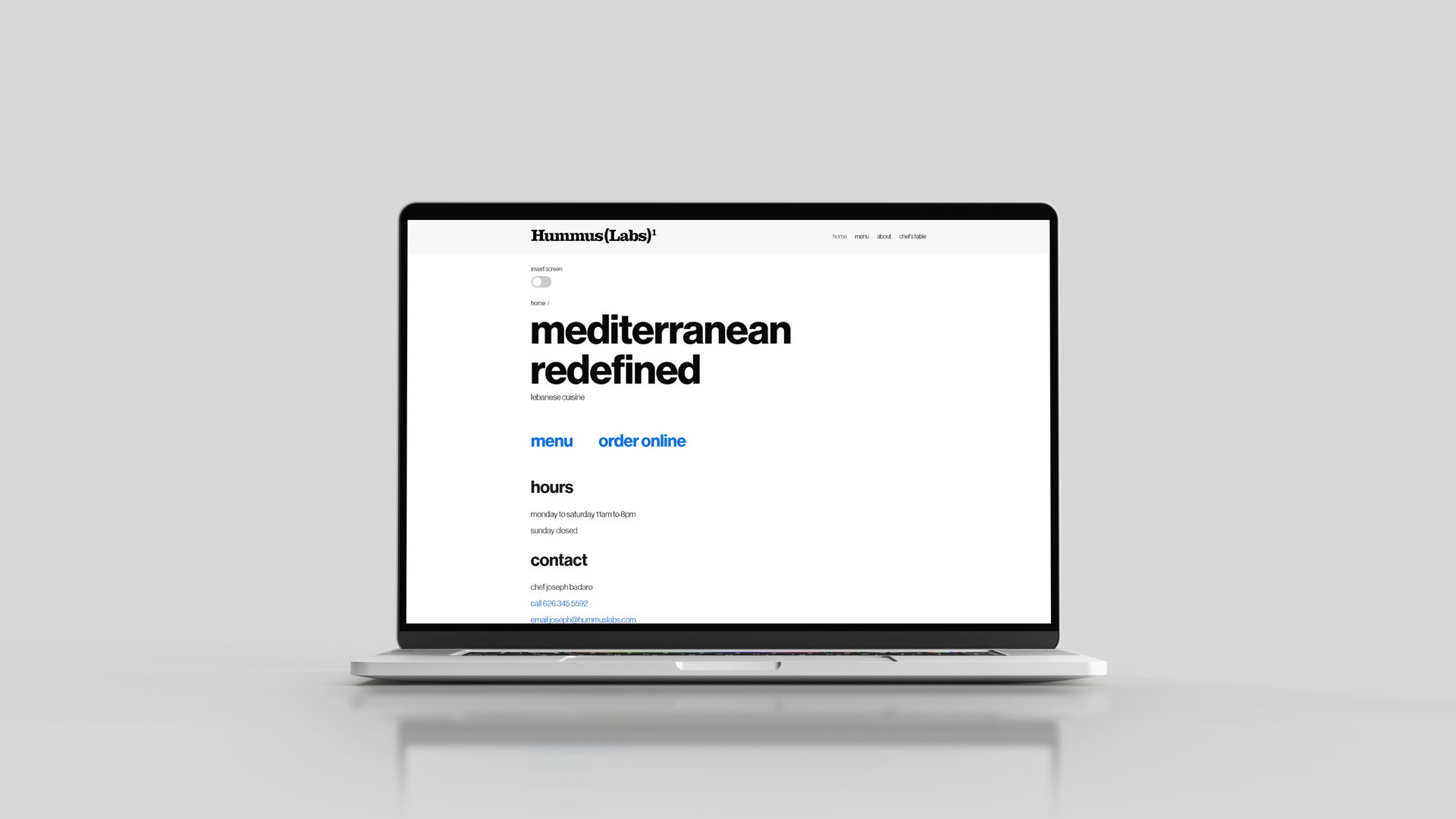
Website
branding, web design, ada compliance
The Hummus Labs website was designed with the goal of being compliant with The Americans with Disabilities Act (ADA) and accessible to those with visual impairments. Utilizing a high contrast, minimal color palette, and minimal graphics in the design, we focused on a user experience centered around the use of screen readers such as macOS and iOS Voice Over. Many features of modern web designs including graphics such as rules or patterns are either non focusable by screen readers or create a roadblock in the user experience for the website visitor. We stripped away all unnecessary components of the website design in order to create a unified user experience for both sighted and visually impaired visitors.

Selected Works
Hummus Labsbranding, creative direction, transmedia design, marketing, ada compliance

Smartracbranding, creative direction, transmedia design, marketing
Smart Cosmosbranding, creative direction, transmedia design, marketing
Root of Ruderalisbranding, creative direction, transmedia design, marketing
Androidbranding, creative direction, transmedia design, marketing
Juiceboxbranding, creative direction, transmedia design, marketing, entertainment
©2024 murphy_armitage