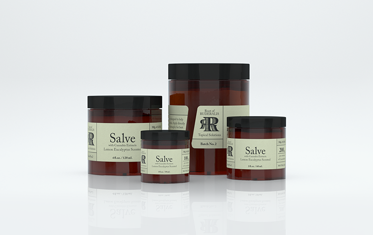
Root of Ruderalis
transmedia design, concept development, branding, creative direction, product development, product marketing, print, packaging, web
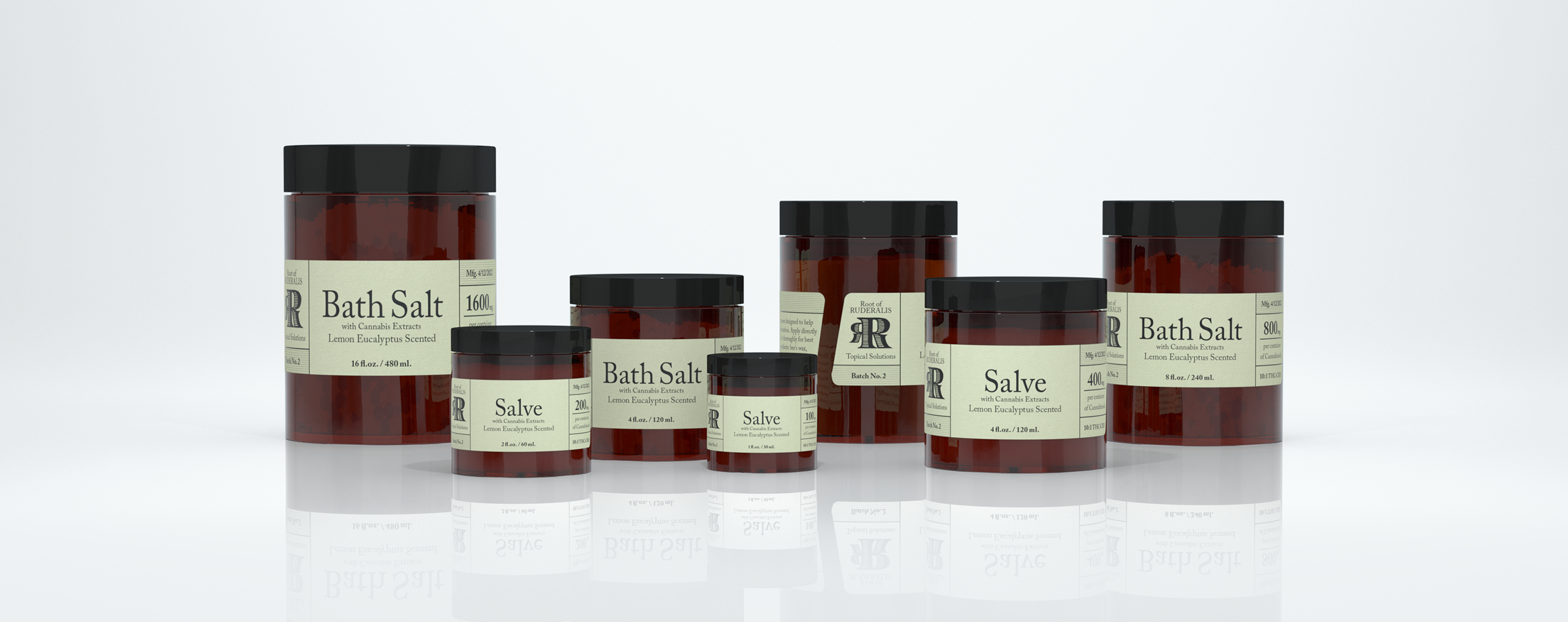
The Root of Ruderalis brand was designed with the goal of making alternative medical marijuana products more approachable to older audiences. The brand produces topical solutions with cannabis extracts designed as a smokeless method of treatment for pain and inflammation. The early rush for medical marijuana brands to produce edibles and topicals led to poorly packaged products with little transparency into ingredients or benefits, resulting in older demographics not considering them as a plausible form of treatment. The Root of Ruderalis brand was created to fill that gap and to provide a transparent, approachable, and easy to understand medical marijuana line of topical products.
Branding
concept development
Brand Goals
attributes
calming
safe
clean
transparent
sustainable
approachable
look and feel
apothecary
botanical
turn of the century
etching / intaglio
woodcut
colonial revival
The main branding goal was to appeal to older demographics and those wary of using medical marijuana as a means for pain relief. There is a stigma with marijuana that discourages potential patients from trying out cannabinoid treatments. Changing the perception of medical marijuana products creates an avenue to move past the stigma and create a more accessible experience with potential end users. The Root of Ruderalis brand seeks to provide a transparent, approachable, and easy to understand line of medical cannabis products by expressing itself with a design language from a more trusting time frame - the turn of the century.
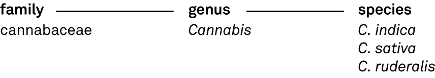
Nomenclature
Cannabis ruderalis is a lesser known species of the genus cannabis. Cannabis indica and Cannabis sativa are widely known as they contain the most THC, the main psychoactive ingredient in marijuana. While C. ruderalis is less common on its own, it's very common practice to breed C. ruderalis with the other species in order to create specialized hybrids. Hybrids bring out specific characteristics in the cannabis plant such as rapid vegetation, auto-flowering, and lower or higher yields of cannabinoids such as CBD and THC. Ruderalis was chosen as a base of the brand name due to its medicinal sounding tone, versatile use in the industry, and its roots in the nomenclature of the genus Cannabis.
Design Inspiration
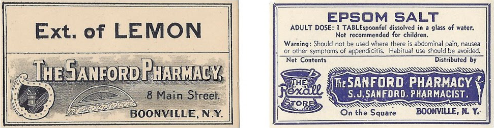
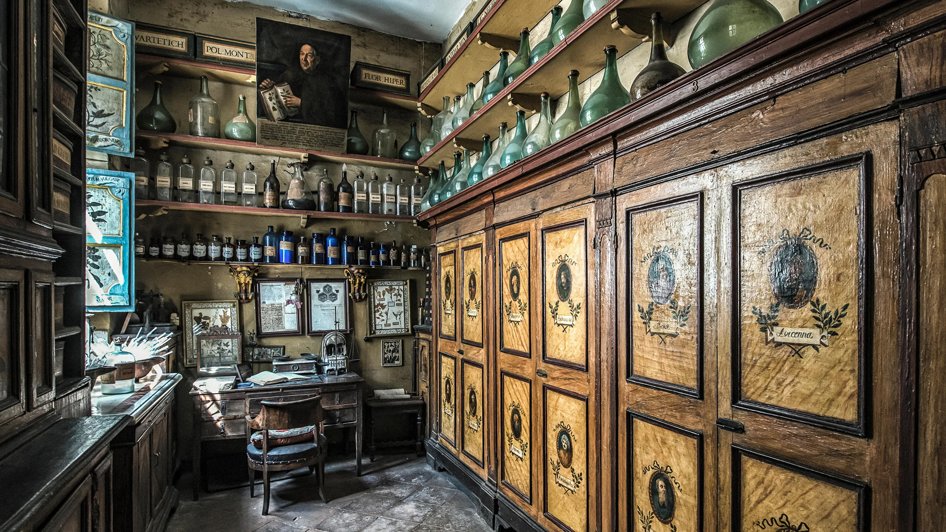
The Root of Ruderalis brand takes inspiration from a design language of a more trusting timeframe - the turn of the century. We looked at visuals and typefaces related to Post American Colonial and Victorian eras such as apothecary medicine, pharmaceuticals, and botanical textbooks representative of the time frame’s approach to visual communication.
Logomark DNA
The logomark was created with a modified version of the Archive Copperplate typeface. Logos and logotypes of the time frame often utilized woodcut and copperplate etching styles in the printmaking application of documents and designs. We wanted the same look and feel to resonate with our audience.
Archive Copperplate
Script, Blackletter
Typography
The Caslon typeface was originally designed by William Caslon in 1725. It had little popularity in Europe but was distributed to much of the British colonies such as North America. Caslon became popular in the typesetting and printing of books and was used in early documents like the U.S Declaration of Independence. The typeface is considered warm and friendly while being comfortable to the eye due to its highly legible and aesthetically appealing qualities. Modern versions like Adobe Caslon Pro slightly depart from the original cut but remain frequently used by designers centuries later.
Adobe Caslon Pro
Serif, Old-Style
Adobe Caslon Pro
Serif, Old-Style
Adobe Caslon Pro - 45 Light
abcdefghijklmnopqrstuvwxyz
ABCDEFGHIJKLMNOPQRSTUVWXYZ
1234567890(,./!@#$%^&*\-_+=)
Adobe Caslon Pro - 46 Light
abcdefghijklmnopqrstuvwxyz
ABCDEFGHIJKLMNOPQRSTUVWXYZ
1234567890(,./!@#$%^&*\-_+=)
Adobe Caslon Pro - 75 Bold
abcdefghijklmnopqrstuvwxyz
ABCDEFGHIJKLMNOPQRSTUVWXYZ
1234567890(,./!@#$%^&*\-_+=)
Color
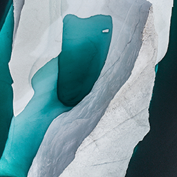
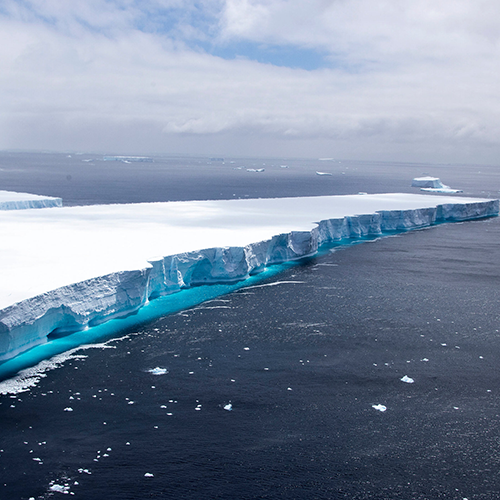
Pain relief is the primary goal of Root of Ruderalis Topical Solutions. With this goal in mind we looked at cool and soothing color pallets for the brand identity. Taking inspiration from Arctic and Antarctic imagery we looked at colors present in ice sheets, snow, glaciers, and the ocean. Blue, teal and their surrounding color tones induce a calming, sympathetic, cooling, and a peaceful psychological effect on the viewer, making it a perfect fit for a brand created for pain relief.

Color Palette

Ice
hex: ebeef1
rgb: 235/238/241
cmyk: 6/4/3/0

Dark Ice
hex: 9ba8b8
rgb: 155/168/184
cmyk: 41/28/20/0

Teal
hex: 2aadb8
rgb: 42/173/184
cmyk: 73/10/28/0

Dark Teal
hex: 05828e
rgb: 5/130/142
cmyk: 85/33/40/5

Ocean
hex: 314c59
rgb: 49/76/89
cmyk: 83/60/48/32

Dark Ocean
hex: 243741
rgb: 36/55/65
cmyk: 84/65/54/50

White
hex: ffffff
rgb: 255/255/255
cmyk: 0/0/0/0

Black
hex: 000000
rgb: 0/0/0
cmyk: 0/0/0/98
Print Design
packaging
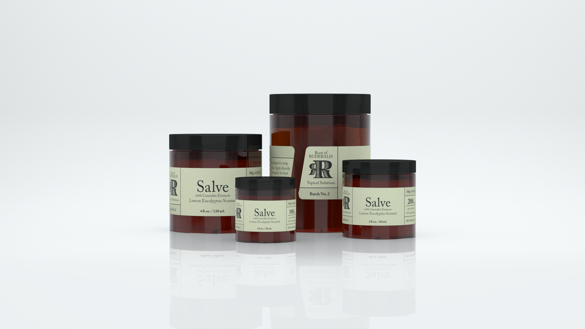
Products
product design, print design, packaging design
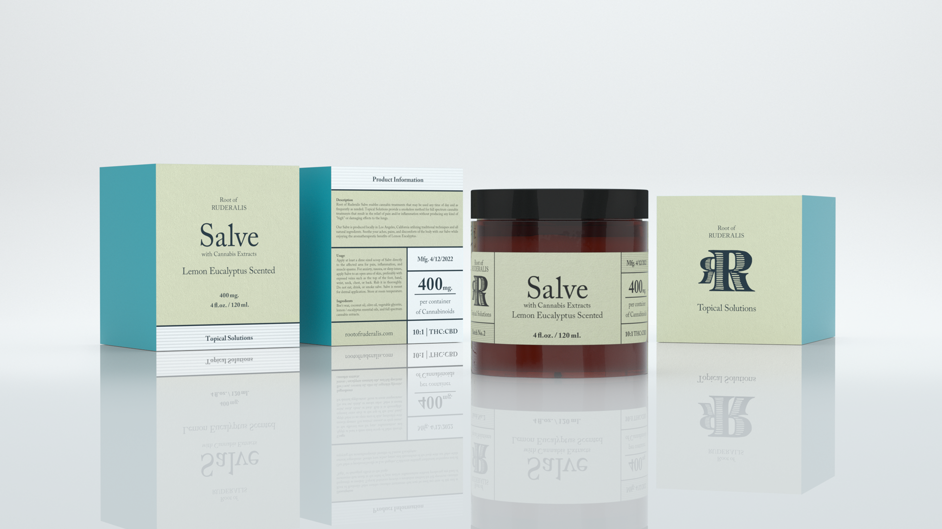
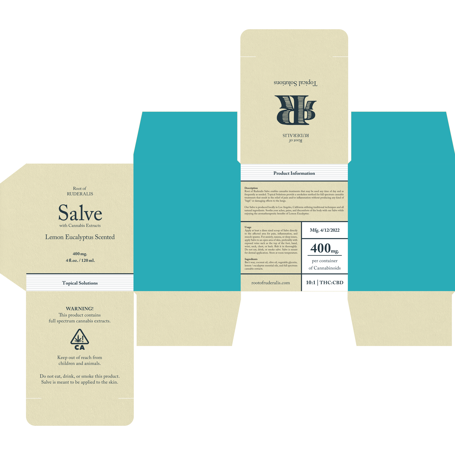
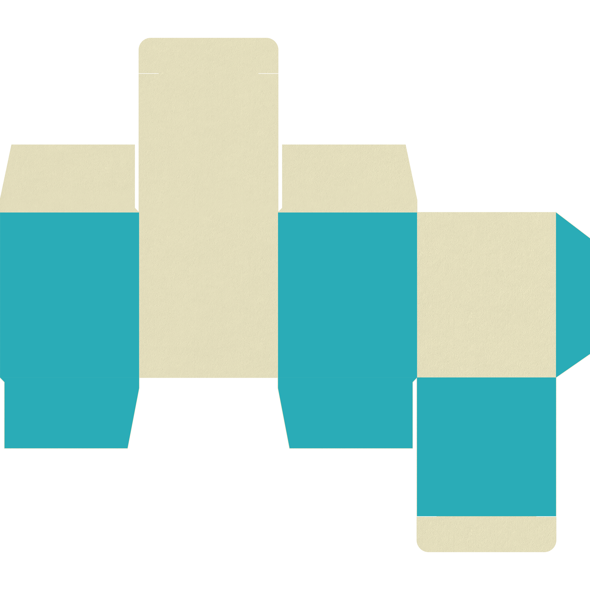
The Root of Ruderalis packaging designs were created to reflect printing processes and papers available around the turn of the century and earlier. We chose to embrace poor trapping techniques and bleed line practices in order to create a larger margin of error in the printing process. By designing little to no bleed area in respect to fold lines and dielines, we created an end result with properly registered typography well within the safe zone, and blocks of color that had inconsistencies around the edges. The strategy created a look and feel with a bit of character that was reflective of old school print processes and homemade products without sacrificing the print quality of product information.

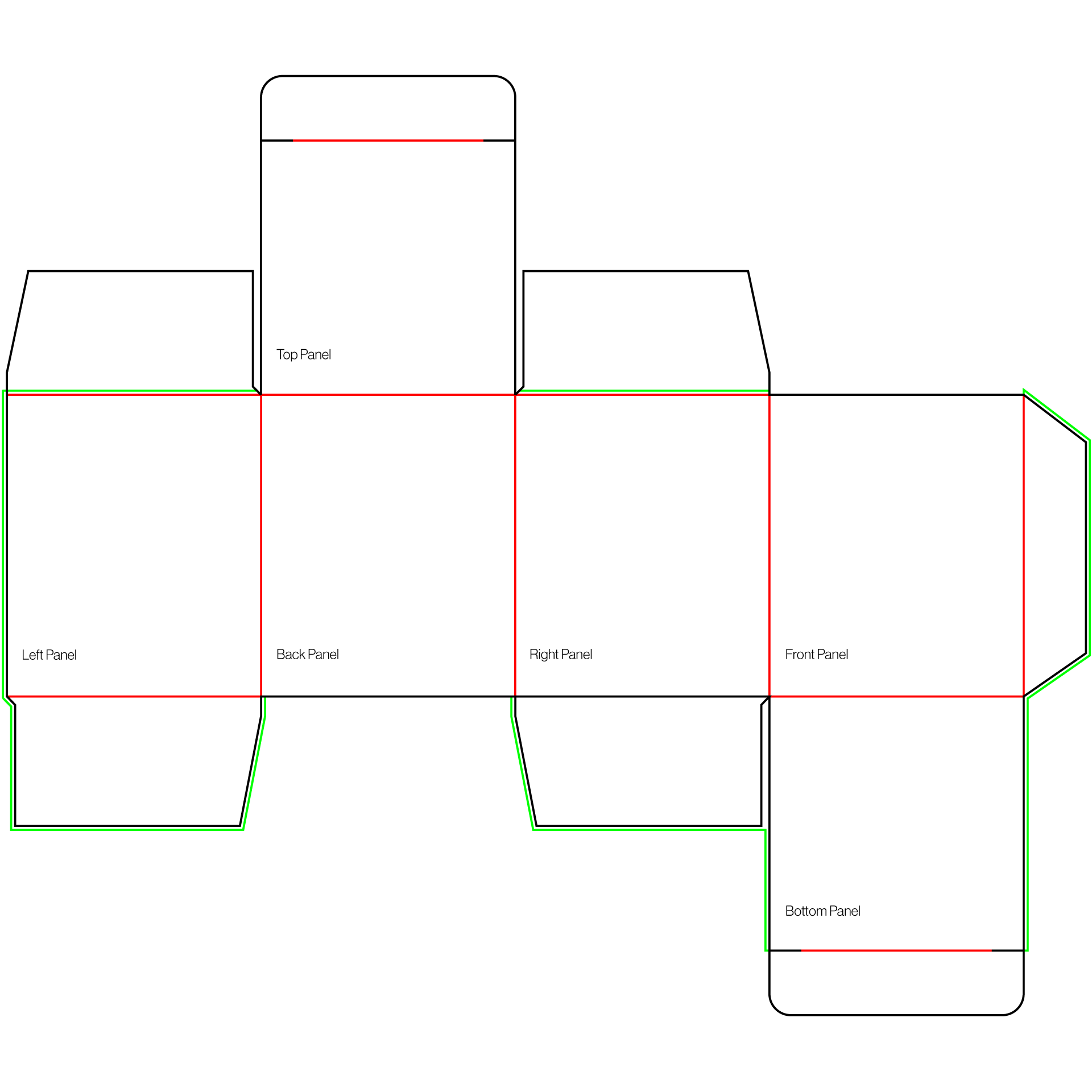
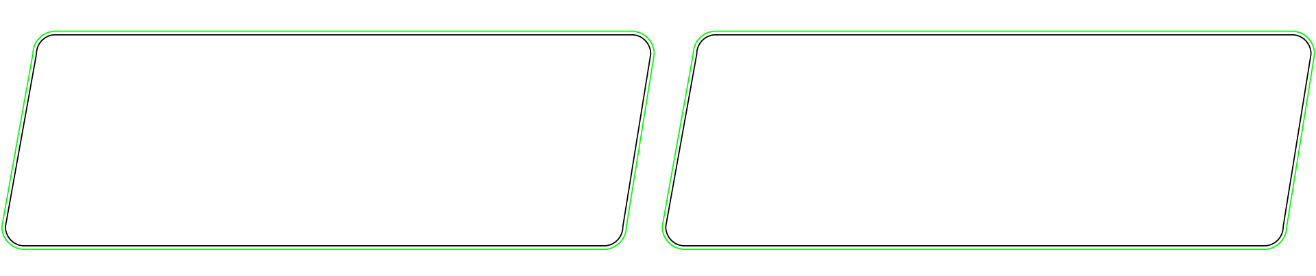
Box Dieline
reverse tuck end folding carton, slit lock tuck flap
– dieline
– fold lines
– bleed
– adhesive
Outside Box
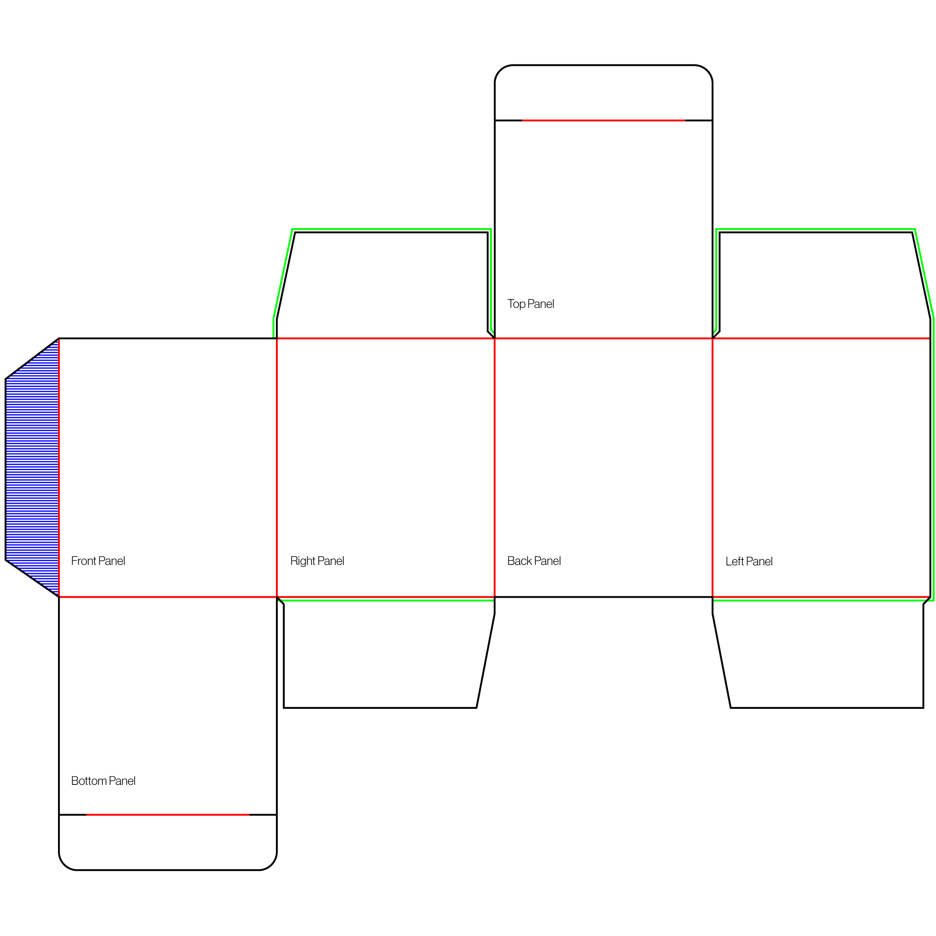
Inside Box
Box Print
offset printing, spot color process
printed on Neenah Classic Crest Sawgrass Paper - 130DTC weight
Outside Box
Inside Box
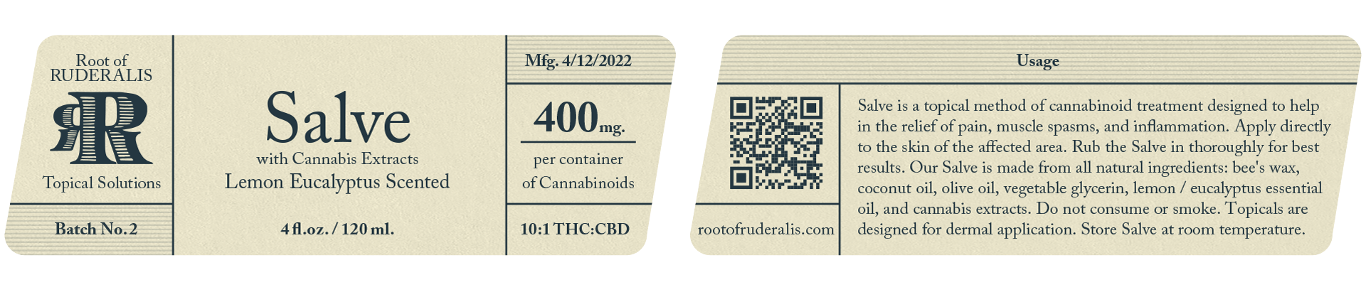
Jar Label Dieline
– dieline
– bleed
Jar Label Print
digital CMYK printing
printed on Neenah Classic Crest Sawgrass Paper - 80T weight
UI / UX Design
website
Website
Selected Works
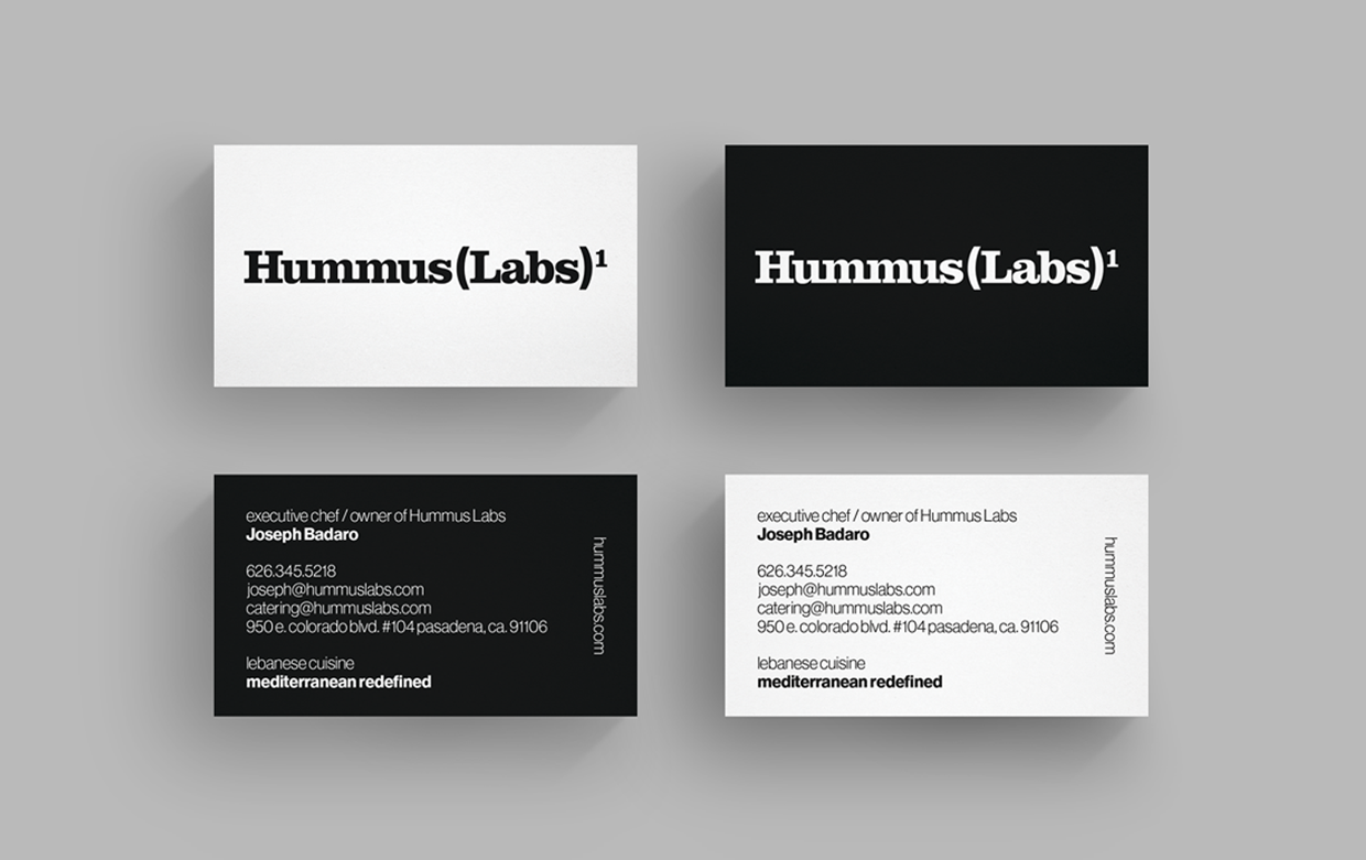
Hummus Labsbranding, creative direction, transmedia design, marketing, ada compliance

Smartracbranding, creative direction, transmedia design, marketing
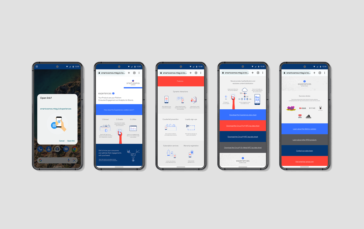
Smart Cosmosbranding, creative direction, transmedia design, marketing
Root of Ruderalisbranding, creative direction, transmedia design, marketing
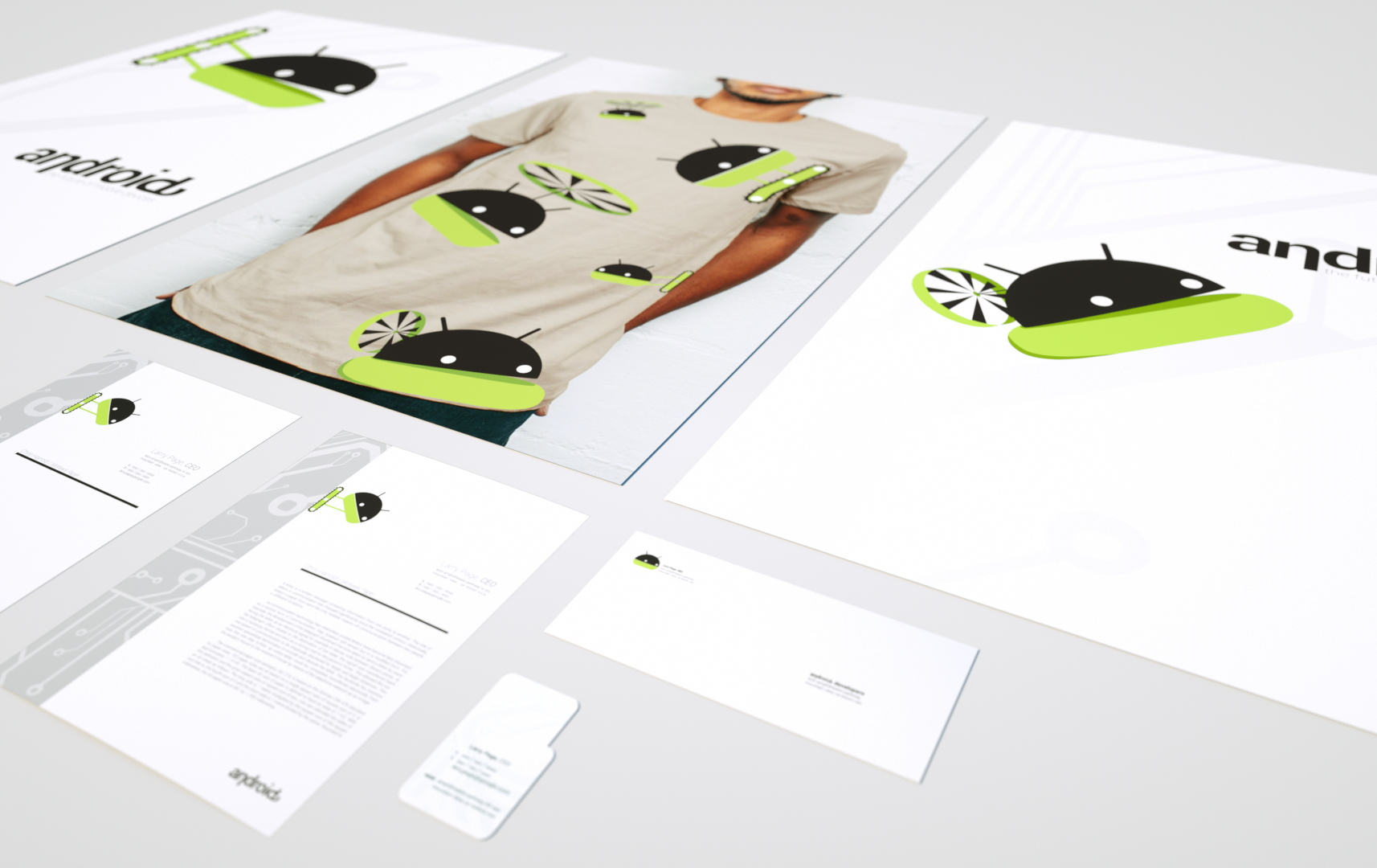
Androidbranding, creative direction, transmedia design, marketing
Juiceboxbranding, creative direction, transmedia design, marketing, entertainment
©2024 murphy_armitage